
An effective banner ad campaign owes its success to brilliant strategy, targeted audience & media placement and to great banner design.
In fact, banner design has the power to gain users’ confidence and prompt them to click the ad or not. That’s why this step should be treated with more attention.
Every time we talk to our clients, we challenge them to go beyond the classic banner ad design and try new things. If we look at today’s successful campaigns there is one thing they all have in common, and that is they approach things differently.
That is why I’d like to share with you some new trends in banner ad design. I hope you’ll be inspired and try out these tips to make the best of your next banner ad campaign.
After reading this article you will understand how to design a banner ad that can increase not only the number of clicks but your brand awareness too.
1. The Duotone design
Some may argue that the Duotone style is an avant-garde design and therefore, too fancy to use it in banner ads. But hey, remember all innovative ideas were welcome with reservation at first and then they set the standards.

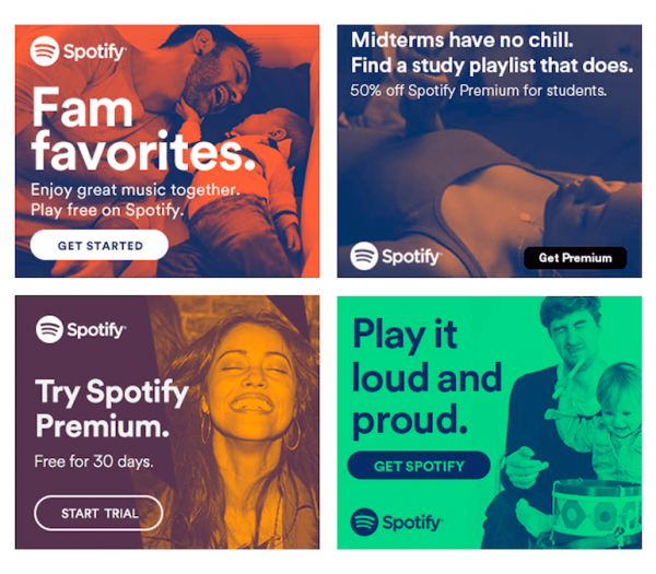
Spotify uses the Duotone style in their banner ads and as we look at these examples, we can notice that they are doing a great job. But before we go further, let’s see what Duotone design is.
According to Wikipedia, “Duotone is a halftone reproduction of an image that brings out its middle tones and highlights.” But to be more specific and put it in a much simpler way: Duotone is the use of two colors. The “Duotone” name and technique comes from the printing press.
And it’s kind of funny to see that this technique that was on a print staple has found its way into the digital world, and it’s now a trend that we see not only in banner ads but also in web design.
The guys at DesignModo wrote a great article about how brands are using Duotone in their designs.
Spotify and the Duotone design Style
Spotify made the Duotone design come back to life again when they unraveled their new brand identity. Duotone was the solution to a problem.
Because Spotify uses images from thousands of artist, they needed a way to make these pictures look like they’re coming from Spotify, even if the brand’s logo wasn’t included.
So they came with the duotone style. This way, even if they shot the pictures using different angles or styles when they put that filter on, they all looked like they came from the same place.
Because the design looks so good, Brett Renfer (Director of Experience Design from Collins) created a software program, named The Colorizer to automate this process. And this was a great solution for a brand like Spotify that has so much visual content to process.
Think about this, Spotify claims to release 20,000 new songs every day and their users have created more than 1.5 Billion playlists.
You can design Duotone banner ads by yourself using Bannersnack. How? It’s very simple.
- Click the Make a Banner button on Bannersnack and then a pop-up window will pop up.
- You can choose to start from a template or from a blank canvas. I usually choose a template. Then the HTML5 is opened.

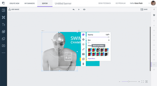
- Click on the image, and then click on the Color settings from the edit toolbar. Then choose the “Black and White” filter.
- Now add a shape and resize it to the banner size (just click the corner and drag it until it’s perfect with the banner size).
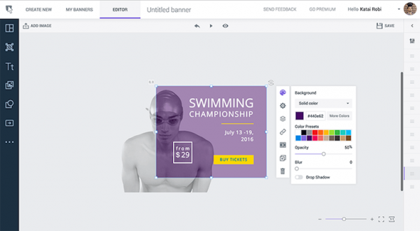
- Fit to the top of the banner, choose a color and reduce the opacity to 50%.
Now you’re ready. Simple as that!
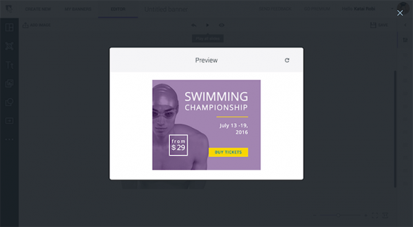
See how easy it is to design banner ads like a pro with Bannersnack?
If you need more information on how to get started with Bannersnack, just watch this video and try the tool:

You can also use Duotone not only for a separate image on your banner ad but also for your background. You can even change your entire banner ad’s style into a duotone one and then just insert a value proposition, CTA button and you are ready to launch your next display advertising campaign.
Now that we know about the Duotone design and how to use it in banner ads, let’s move on and see what other ideas we can use to get more clicks on our banner ads.
2. Minimalism
In the age of the overcrowded Internet, where everybody wants to get noticed, there is design style that can help your banner ad stand out with minimal resources: the minimalist style.
But what is minimalis? Where does this style come from? Who used it first?
Let’s start with the definition:
According to Wikipedia, “minimalism is a style that uses pared-down design elements.” If we look at the visual art culture, this style is generally referred to as “minimal art”, “literalist art” and “ABC art”. This art began in post-World War 2 Western, most strongly with American visual arts in the 1960s and early 1970s.
Minimalist design is identified by the resemblance to the simplicity of nature. Click To TweetEverything around us is influenced by minimalist design, starting from UX, hardware design, cars, films, games, web design, and other visual design elements.
If you want to read more about the history of minimalism and some of the other influencers of the trend, I recommend you this article from SpyreStudios.
But let’s get back to our industry and see how we can use minimalism design in our banner ads. As I said, because the internet is overcrowded, we need to use only important elements in our banner ads to make users click.
“When surfing the web, our retention capacity is reduced to that of a young child. In such a context, and with only seconds to stand-out, the minimalist principle ‘less is more’ will make a lasting impression. ” Simon Le Bouthillier, WeeklyM
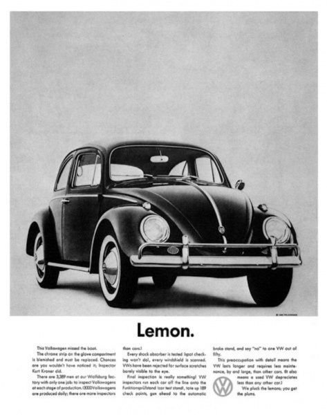
Sometimes I wonder how the Lemon Volkswagen ad looked like if they used it in a banner ad. How many people would have clicked on it? What would the CTR look like?

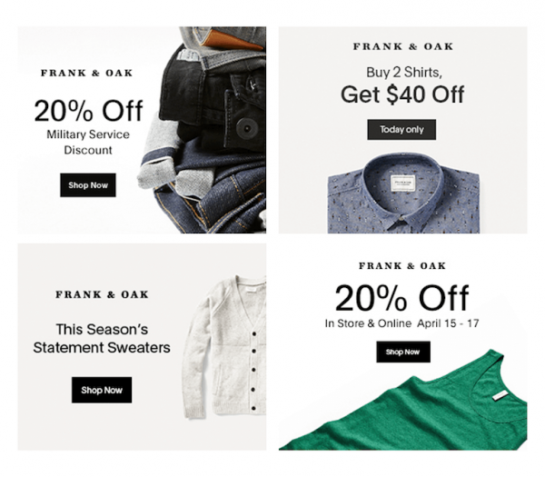
But let’s not go further with our imagination and stay close to reality. We can still use minimalism in our banner ads like the “Frank & Oak” brand does.
The most important thing if you want to design a minimalistic banner ad is to use high-quality images and also choose only the most important elements you want to add on your banner ads. Maybe you have a limited promotion or maybe you just want your brand awareness to get higher.
Minimalist design doesn’t mean using as much white space as you can but using strictly the most important elements.
3. Pastel Colors
Often times, I heard that finding a great background color for a banner ad is extremely hard. Many marketers and designers are struggling with this element in their banner ads.
In my research, I found that the best banner ads that get clicks are the ones that use pastel colors or the ones that stay close to their brand identity. But let’s take a closer look at the pastel colors and see why they’re important and how they can make a banner ad not only visually appealing but also clickable.
Wikipedia says that pastels or pastel colors got the name from pastels, an art media characteristic of this color family. These colors are said to be “soothing”, “soft”, “neutral”, “washed out” or “desaturated”, and lacking strong chromatic content.
The typical pastel colors are pink, mauve and baby blue. But I believe that there is so much more to this type of color palette.
You can use pastel in photography, web design, illustrations, flat design, typography, for UI elements and also in banner ads.
But the important key in using pastel colors is to design something that has a fresh look and it’s not washed out. By nature, this design style has a relaxing and calming atmosphere.
I recommend you use that in your advantage when you are about to design a banner ad. Also, do not forget that the other elements in your banner ads should interact with this color palette.
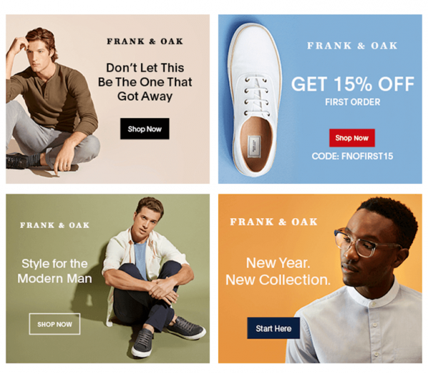
As you can see in these “Frank & Oak” banner ads, they used pastel colors to let the message and the model stand out and have an impact.
4. Vivid Colors
How courageous are you with your banner ads? What about when it comes to color?
A bit different from what you just read about pastel colors, this part is for people who dare to try new, interesting and bold things.
This is the part where we talk about vivid colors.
What does vivid mean?
“Vivid” is an adjective that describes an adventurous and bright color, a powerful feeling, or an image in your mind that is so clear you can almost touch it.
The word “vivid” comes from the Latin word “Vivere” which means “to live”.
So, to make it more clear – vivid is something intense. This is what I’m talking about when I say “vivid colors” – intense colors.
But what about designing banner ads using vivid colors? How can we use these colors in our banner ad design? Isn’t this too aggressive for the user?
When you design banner ads and you are looking for the right colors, you should first make sure the design is close to your brand identity. Then go to your brand identity manual and pick up the colors. But if you don’t have such a manual, we recommend you use our preset colors.
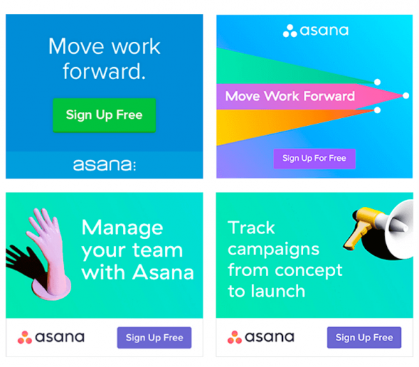
Here is a cool example of how to use vivid colors in your banner ads. Asana redesigned their brand identity in 2015 and found out that their brand is characterized by 6 points: intentional, empowering, passionate, playful, authentic and effective.

Taking these 6 points into consideration they not only redesigned their logo but also recreated the entire UI platform and they chose these vivid colors you can now see in their banner ads.
Here is Asana’s redesign story and how they came up to this at the final point.
The main idea you should get from this is to think really hard about your brand identity when designing your banner ad but to also be bold when you want to try something new.
Bold and unafraid can sometimes bring you results you don’t even expect.
5. Native Photos
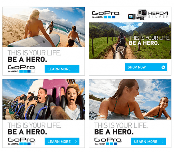
I don’t know if I have already told you this, but my favorite social media network is Instagram. Not because it’s trendy or because it’s mostly mobile (ok, you can include this reasons too) but because I can see the entire world from a different perspective and never get bored of it.
But Instagram taught me an important lesson – how to use native content.
Just go through your Instagram feed and you will see that most of the images and videos are native by creation. They were taken using a phone, some editing (contrast, color, a little filter) and then uploaded. And the best Instagram ads you can create to bring more results are the native ones.
GoPro uses this strategy in their banner ads campaigns.
They use content from their users to create their banner ads and to reach out to the user that wants to feel like the person they see in the banner ads. I’m saying this because I’m in this position too. I’m looking at the beach banner ad from GoPro and I wish I were there right now.

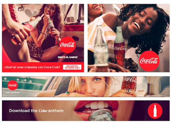
Coca-Cola is another great example of how to use Native Photos in your banner ads.
After they came up with a new campaign – Taste the Feeling, they showed the world that the best visuals you can use in your campaign are the native visuals. Just look at these photos and you can see that many of them are just like the photos you see on your Instagram feed. Native. Exactly.
So, the conclusion: try and make it as real as you can.
If you’re working on your laptop in a coffee shop, just go out there, take your smartphone (but at least make sure you have a good smartphone) and take some pictures of the atmosphere in that place. See how people interact, talk to them and ask them if they mind being in the picture you take. Then use these photos, insert their testimonials, use your brand color in your banner ads and hit the save button.
Tweet "The best content is not about quantity or quality, it’s about being real. Click To TweetStay true to your brand not only with the logo or colors but also with the image and the feeling you want to communicate.
Conclusion
That’s it for today. I hope these 5 banner design ideas will help you get more clicks and conversions.
Pick one that suits best your brand and test it to see what happens. If the results are positive, stick with it for a while. Don’t change your banner design strategy too often, you will confuse people. Remember you want to build an identity.
Let me know in a comment below which one of these banner ad design trends are you going to use and why!