

Whether we are talking about serif, sans serif, proportional or monospaced typefaces, one thing’s clear—the font dictates how your brand is perceived by others.
Nowadays, design tools offer thousands of banner fonts for you to use to make a banner.
There are no limits when it comes to banner design besides your own inspiration and imagination.
Not so long ago, however, advertising relied only on printed media inserts and outdoor displays. Back then, the marketer’s job was infinitely more difficult.
Moreover, the choice of fonts was limited to a few typefaces. Metal fonts were stored in metal boxes, and texts were assembled manually, letter by letter.
Now, you may wonder how to choose to best fonts for banners, when there are so many options available today.
This article will hopefully help you make a quick and inspired choice because I’m going to talk about 35 cool banner fonts.
Before you continue reading, you have to keep in mind that fonts are not only about your taste in design. Colors, fonts, and typography should also represent and appeal to your target audience, once you create your buyer personas.
Now that we’ve established that let’s get started.
What Are the Different Types of Fonts?
We can easily separate fonts into four major categories:
- Serif
- Sans Serif
- Script
- Display
Serif fonts look rather traditional and have little lines attached at the ends of each letter. Times New Roman, for example, is the best-known font type in the Serif category.
Sans Serif (French for “without Serif”) fonts look similar to the ones mentioned earlier but without the attachments at the end of each letter. They are believed to give a modern look to your text. A good example, in this case, is the font Calibri.
Script is a denomination used for all the fonts that look cursive, by imitating handwriting. You can quickly identify them because, in most cases, they carry the word Script after their name. Take, for example, the font Pacifico.
Display fonts are usually used in decorative texts or when you want to attract even more attention to your message. They are used mostly to make an impact and not for long texts or phrases. A good example, in this case, is the font Permanent Marker.
Now, let’s get back to our main topic and take a look at these 35 cool banner fonts you can use in your banner design.
1. Volkhov

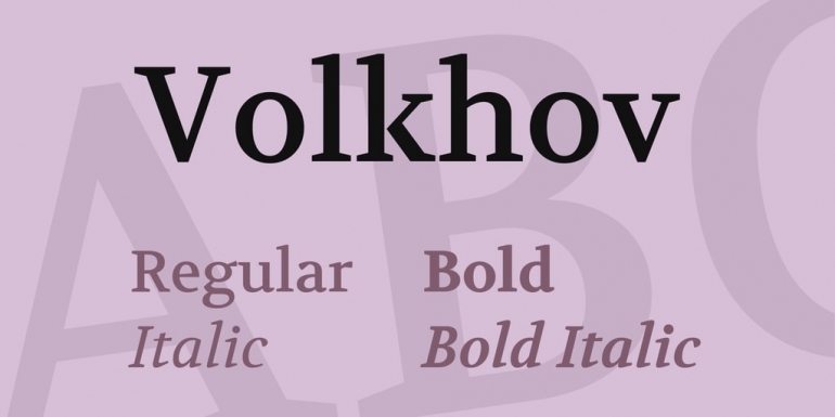
Our first classic font is Volkov, a Serif typeface with a robust design, legible and prominent, suitable for complex texts.
You can use it as a title in your banner designs, but it will be more suitable as a message bearer font. Unlike other Serif fonts, Volkov looks elegant in a modern design and features a natural flow that makes it readable.
2. Source Serif Pro

Source Serif Pro is yet another excellent example of a Serif font. It’s thinner than Volkov but similar in style. Also, it makes the perfect choice for a banner that relays a longer message.
It works well, however, with any kind of copy text, regardless of its length. It’s elegant and easy to read.
3. Advent Pro

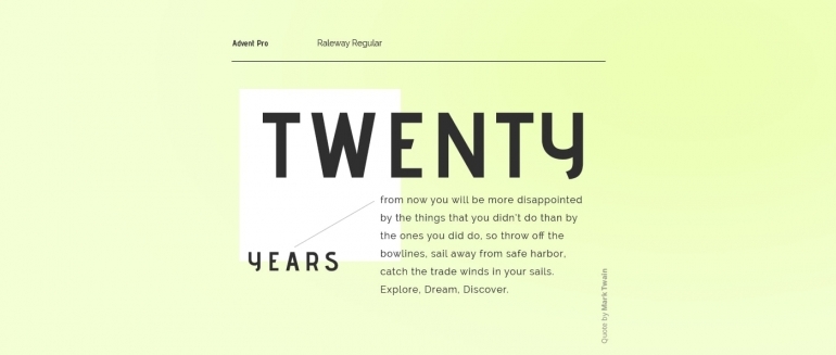
Advent Pro is our first Sans Serif entry on this list of great looking banner fonts. It’s a modern-looking typeface with a thin design that makes it perfect for banners with a simple monochrome background.
However, it comes in seven different modes: thin, extra-light, light, regular, medium, semi-bold, and bold. This is why it can be adjusted to suit any banner regardless of its design.
Get industry news, studies, how-to articles, exclusive Bannersnack offers and product updates every other week.
4. Allura
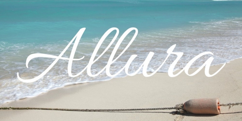
Although it is a Script font, we like Allura because it looks not only stylish but also easy to read.
Therefore, it is perfect for a banner design. Allura was designed by Rob Leuschke and comes from the finest hand lettering fonts family, which includes non-Scripts as well.
5. Open Sans

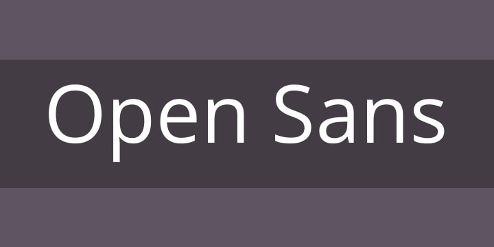
If you are looking for a free banner font that will give your banner a clean and readable look at the same time, take a look at Open Sans.
The font is optimized for both print and web and it also looks great on mobile.
If you are preparing a marketing campaign, the way the banner looks on mobile devices is fundamental, since the majority of consumers spend a lot of time on their smartphones.
Another important fact is that Open Sans contains a complete 897 characters set, which makes it available in almost all languages, including Greek and Cyrillic.
6. Playfair Display

Our list of 35 best fonts for banners continues with yet another typeface you can use as the primary choice for banner titles.
Playfair, even though it is not a traditional Display font, bears this name because it was designed especially for large-scale display use.
However, you can also use the Regular style for body text.
7. Rock Salt
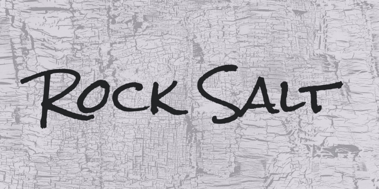
Another cool banner font is Rock Salt, a typeface that will give your banners a personal and out of the box look. It was designed with felt-tip markers, and it certainly looks like it. It is available only in Regular style and uppercase.
In many ways, it looks very similar to the fonts we can find in comic books.
8. Sacramento
Sacramento is a free banner font that falls into the Script category. In other words, it mimics handwriting. It does this quite well, being one of the most accurate Script typefaces available today.
The font is round, stylish looking, and easy to read, just like traditional handwriting.
If you are looking for such a font to complement your title or your body text, Sacramento may be the perfect choice.
9. Ultra
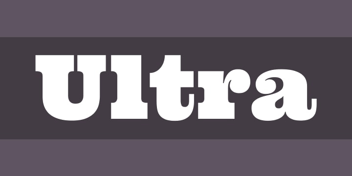
Ultra is a free banner font that falls into the Display category. It’s a wood type style with bold letters but very easy to read. It’s perfect to create a powerful headline that looks sharp and dramatic.
If you are looking for a traditional-looking headline, this may be precisely what you needed. However, note that it can take a lot of space, so if you intend to squeeze in a longer message, it may not be suitable.
10. Veteran Typewriter

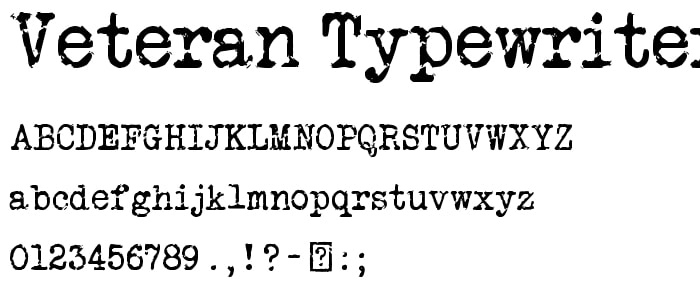
Veteran Typewriter is another display font that can be mistaken with a Serif font because it mimics perfectly the typewriter letters.
Although it bears a Serif looking typeface, this font is recommended for titles only and call to actions in some cases.
It may not convince you at first, but we assure you it is quite readable and stylish looking when you use it on the right banner.
11. Short Stack

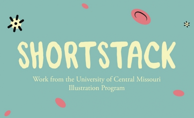
If you are looking for a free banner font similar to Rock Salt but with lowercase letters included, Short Stack is a great choice.
The semi-geometric, low contrast look gives this typeface a stylish appearance that resembles the handwriting that mimics block letters. You can use it for texts that range from medium to large sizes.
12. Quattrocento Sans
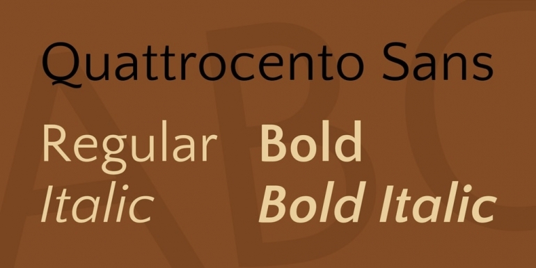
Quattrocento Sans will give your body text a classic yet elegant look. This font is designed to be legible even when used in smaller sizes. It provides warmth and readability to your message and comes in four styles: regular, italic, bold, and italic-bold.
It will look better when combined with other Sans Serif fonts or in conjunction with a script typeface.
13. Poiret One
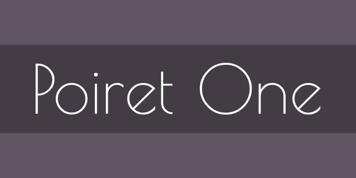
Are you looking for a font that will look decorative, geometric, and fresh at the same time? Well, Poiret One encompasses all these traits successfully.
It is the ideal font for titles, labels, headlines, signs, and even logos.
You can use it for body text on your banners if you are looking to add some style to your message. Although it looks good in all caps, it’s recommended to use Poiret One in lowercase.
14. Pinyon Script
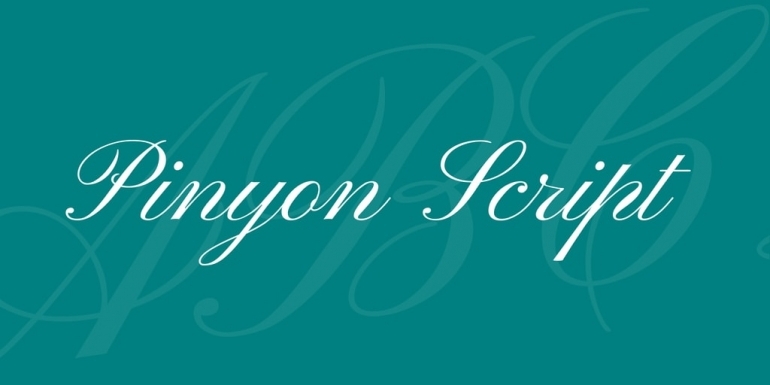
Pinyon Script is yet another Script font that adds refinement and readability to your message. It looks friendly enough not to be intrusive and its legibility can add to the power of your message.
Note that Pinyon will look best when used in larger sizes. It comes in only one style—Regular.
15. Nobile
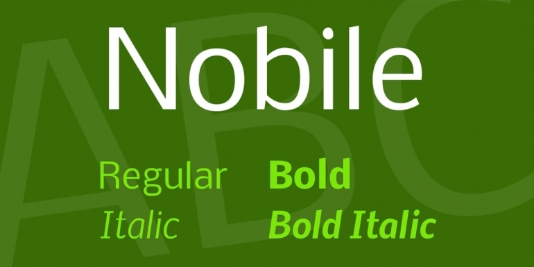
Nobile is an excellent banner font suitable for both body text and titles. The font was created by Vernon Adams, a designer that graduated with an MA in Typeface Design.
Like most of his fonts, this one is an open-source Google font.
What makes it suitable for banner design is that Nobile looks great on desktops and mobile devices as well. It’s legible, good looking, and comes in six styles: regular, italic, medium, medium italic, bold, and bold-italic.
Related articles:
20+ of the Best Script Fonts to Make Your Creative Projects Stand Out
30 of the Best Vintage Fonts to Use for Timeless Designs
60 Modern Fonts To Help You Find A Cool Voice For Your Brand
16. Luckiest Guy

Inspired by the advertisements of the mid-twentieth century, Luckiest Guy is a display font suitable for titles and other texts that are meant to catch the viewer’s attention in just a few seconds.
It comes in only one style, Regular and only with uppercase letters. In a way, it resembles handwriting but in a very bold manner.
17. Knewave
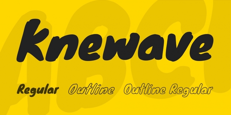
Knewave may be your choice for a title font if you don’t like Luckiest Guy. It also comes only in a Regular style and supports lowercase characters, which resemble more an italic style.
This is also a bold font suitable for very prominent messages, mostly titles or call to actions, that are meant to draw attention instantly.
18. Montserrat

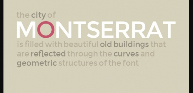
Another great addition to our banner fonts list is Montserrat. It was created by Julieta Ulanovsky, another designer with a degree in Typeface Design.
The font was inspired by some old signs and posters from Buenos Aires. It is perfect when you want to highlight different messages or lines of text in the same typeface.
This option is possible because Montserrat comes in 18 different styles. They vary from thin to extra bold.
All of them are easily readable and suitable for both title and body text.
19. Parisienne
Remember our 8th entry from this list, the Sacramento font? Well, Parisienne comes with a similar style that mimics the human handwriting but with a rightward slant.
The letters are round, stylish, and good looking. They are also easy to read and connected, like the Sacramento letters.
If you are using an italic title or an italic body text that needs to connect with a similar message written in a handwriting-type font, Parisienne may be your best choice.
20. Francois One
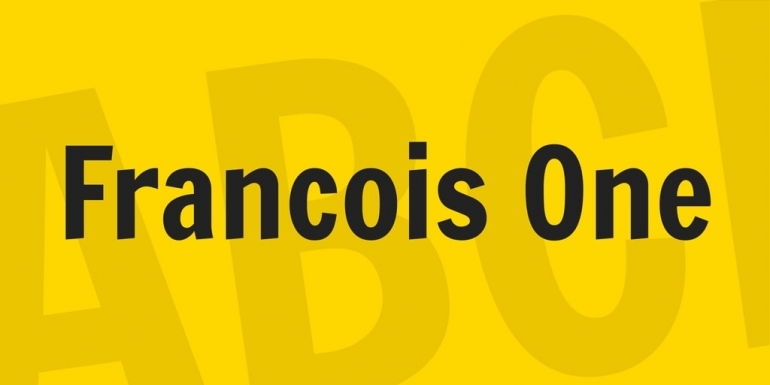
Francois One is a Sans Serif font perfect for web use, readable on desktops, and smartphones as well.
Although it’s best to use it for titles, it may prove to be effective as a body text, if you use short sentences or short call to actions.
It comes in a single Regular style, which looks rather bold, which is why we recommend it for titles.
21. Helvetica


Helvetica is a neo-grotesque typeface. It was created in 1957 by Max Miedinger and Eduard Hoffmann, and it was highly used in the 60s and 70s.
It’s clear and easy to read, and it has a lot of variants—this being the reason for its popularity. In 2007, to celebrate the 50th anniversary of typography, Gary Hustwit directed a documentary about this font.
Everyone knows Helvetica because it’s everywhere—from income tax forms to television ads, online advertising, and billboards.
Designers either love it or hate it, but they never argued its dominant presence.
So why is this classic font so popular?
Although it has tight spacing letters, it is ordered, clear, has an oblique rather than italic style, and it basically goes everywhere and with everything—online or offline.
Ad Examples from Famous Brands Using Helvetica
This highly acclaimed font is the face of online advertising for various famous brands, such as LG, Lufthansa, or NBA.
Here are some examples of display ads where some variations of Helvetica were used.


22. Univers

Created by Adrian Frutiger in 1957, this typeface had the greatest success in the second half of the 20th century, and now it’s one of the most used font styles in advertising and media.
What makes this font great? It has a variety of weights, but even if you combine them, it still gives the reader the feeling of steadfastness.
Among its characteristics, you can see that the letter Q has the tail on the baseline, and the dot on i is a rectangle.
This font was considered so effortlessly elegant that it became an instant classic.
Ad Examples from Famous Brands Using Univers
With so many variations, this font can be used in different combinations and still be eye-catching, making it one of the best fonts you can choose if you want to make the text pop.
Here are some ad examples from eBay and FedEx.


23. Frutiger


This is another sans serif typeface designed by Adrian Frutiger created especially for the directional sign system in the Charles de Gaulle Airport.
The font has its roots in the Concorde font, the one that determined Frutiger’s beginning.
Even the lower cases have increased clarity due to its open apertures. Because of its high legibility, it can be used for various purposes and materials. The A has a low central bar, and the i has a square dot.
Ad Examples from Famous Brands Using Frutiger
Besides being seen everywhere in the French airport, the Frutiger was preferred by the popular online photo-sharing platform, Flickr.

24. Futura


Designed by Paul Renner in 1925, a truly versatile and stylish typeface ideal for any form of advertising, posters, magazines, and books, Futura was also the subject of a book published in 2017 called Never Use Futura (The History of a Typeface).
It’s everywhere, including on the commemorative plaque left by Apollo 11 astronauts on the moon in 1969.
It explains the “uses of a face that’s so common you might not notice until you start looking, and then you can’t escape it.” The condensed variants make an excellent display for designs.
This font can also be squeezed in small spaces and still be legible.
Ad Examples from Famous Brands Using Futura
Futura is indeed one of the most versatile fonts.
It was preferred by notable directors such as Stanley Kubrick, and it was everywhere throughout the movie V for Vendetta.
Bethesda Softworks used the font in many of their games, and the list can easily go on.
Large brands such as Cisco, PayPal, D&G, and Nike also chose this font for their online advertising. Here are some examples.


25. VAG Rounded (VW)


Initially designed for the corporate typeface for Volkswagen in 1979, this font got to be owned by Adobe.
It’s still used in advertising, precisely for its simple, corporate style, yet so powerful. It resembles the font Futura, but it has, as the name suggests, more rounded shapes, which can be considered friendlier by most people.
It’s space-efficient, linear, and fun to use. Imagine putting this font on a colorful background. Exactly, it’s the hippie age again.
Ad Examples from Famous Brands Using VAG Rounded
Being so warm and friendly-looking, this font is currently used by Reddit in their logo and online advertising:

26. Gill Sans

It’s a sans serif font created by Eric Gill, based on the 1916 Underground Alphabet, the font of the London Underground.
Gill Sans was released in 1928 by Monotype, and its appearance combines a modern and classical look altogether.
In 1948, British Railways chose Gill Sans to be the typeface for all the posters and timetables. This font soon became the top choice for the titles on Penguin Books.
Can it get more classic than this?
Its simplicity and clarity made it easy to be used in both small and uppercase, being a perfect choice for advertising as well.
To this day, Gill Sans is the face of BBC’s logo.
Although in 2017, BBC designed its own typeface called Reith, created precisely for the digital world, they didn’t change it in the logo. This one simply has a British aura.
Ad Examples from Famous Brands Using Gill Sans
Gill Sans was the choice for BBC and Tommy Hilfiger in their online advertising.


27. Avant Garde

This font was a breakthrough for the world of typefaces. It was designed by Herb Lubalin for the Avant Garde magazine logo, but it instantly gained success and became a font.
Its style is futuristic, with precise geometric shapes and hard angles that line up. The letters work together and the text stands out, thus being perfect for titles or logos.
Ad Examples from Famous Brands Using Avant Garde
Avant Garde can be seen in the digital space used by big brands such as Adidas, Calvin Klein, or Bloomingdale’s.


28. Meta


Designed in 1991 by Erik Spiekermann, this font is a humanist sans serif typeface.
It has been used ever since by companies in their texts and logos, one of them being The Weather Channel. Since 2010, it’s the official typeface of the Greece Government.
Spiekermann wanted to create an entirely different font from Helvetica. This aspect can be noticed in the letter M, which resembles more with Futura.
Meta was also used for a massive range of product labeling.
Ad Examples from Famous Brands Using Meta
The Meta font is currently being used by The Weather Channel and Herman Miller in online banners.


29. Avenir


This font was designed in 1988 by Adrian Frutiger and considered by the typeface designer himself the best work he ever created.
It is classified as a geometric sans, but has a human touch as well, like the tail on the t, or the imperfect o.
It was adopted by many universities as their main sans serif font in branding guidelines or text captions. Avenir was even used by the Eurovision Song Contest for all the brand communication materials between 2014 and 2017.
Ad Examples from Famous Brands Using Avenir
Avenir is the font of choice for Aol, Toyota, or Black Decker, among many other brands.


30. Times New Roman


Another classic we cannot miss. This font was initially created in 1931 after designer Stanley Morison said the newspaper is not legible enough.
In 1932, Times New Roman was used in the paper. It was also one of the first fonts to be digitized. Nowadays, you can find it everywhere.
When you want to play safe writing a paper, you cannot go wrong with this timeless font.
I know—it’s categorized as a serif font, but some brands still use it in their digital advertising. I simply think it deserves to be on this list.
Ad Examples from Famous Brands Using Times New Roman
A classical look for classy products, this font knows how to help them look good online, too. We’re talking about Tiffany & Co. and GUESS.


31. Knockout
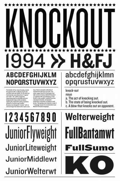
This is a sans serif typeface designed by Jonathan Hoefler and Tobias Frere-Jones, in 1994.
It has nine different widths, and each of them has 32 variations, taking us back to the 19th-century typefaces that foreshadow the idea of uniformity.
32. Akzidenz Grotesk


Even the first word from its name indicates the purpose of it being designed—for commercial and publicity.
It was created in the late 19th century, but gained popularity during the 50s and 60s when designers started using it. This font left the influence of Art Nouveau and embrace simplicity.
The letters have a similar width, and unlike most sans-serif fonts with a double-story g, this font uses just one story for it.
Akzidenz Grotesk made a smooth transition from posters and brochures directly on-screen, allowing pages to have a distinctive feel.
33. DIN

This font seems to be one of the most used ones by graphic designers. It’s a realist sans serif typeface, designed in 1995 that manages to differentiate itself from other fonts with its perky high x-height and curled l.
It even got to be the best-selling typeface on MyFonts. It is legible and easy to use when you need to give an industrial, corporate look to your marketing materials.
34. Franklin Gothic

This typeface was designed in the early 20th century by Morris Fuller Benton, and it used to be present in many advertisements and newspaper headlines.
It started to gain popularity among designers in the 40s. Being perfect for headlines rather than body text, this font will make your title look like you have something significant to say.
It simply stands out.
35. Minion

Designed by Robert Slimbach for Adobe Systems in 1990 in the form of a body text—condensed on-page but easily readable—it’s perfect for printed materials as well.
This seems to be a rather shy serif font, inspired by the Renaissance era. Nonetheless, the classical look on this was also perfectly designed for body text, with high legibility.
The classification into the serif family should not scare you.
Conclusion
When it comes to banner design, everything relies on how you manage to relay the message to your audience.
The visuals matter, but the body text is also important. At the same time, it is essential to make it not only readable but attractive as well.
To do that, you need to carefully select the appropriate fonts for each banner in particular. The fonts should complement the message but also the overall style and look of the banner.
This article was meant to present you with 35 fonts for banners so you can choose a suitable banner font based on our examples and descriptions.
So, let us know: what’s your favorite font to use for online advertising?