
Let’s be honest and recognize that we don’t like those pop-ups that are shoved in our face every time we want to experience something on the internet.
Personally, I don’t like it when I want to read something on a blog post and in a few seconds a pop-up is assaulting me with a new offer or a new ebook.
I believe in the importance of a user experience and many brands sometimes forget about this. They are putting themselves first and then the user/client/customer in the second place. Well, my dear marketers, designers, developers or entrepreneur, let me tell you this – if you want to succeed in this digital world, you need to think about your customer first and then about your brand.
But pop-ups are not so bad after all, if they are used properly, right? There are a few secrets that can help your pop-ups get more conversions for your brand.
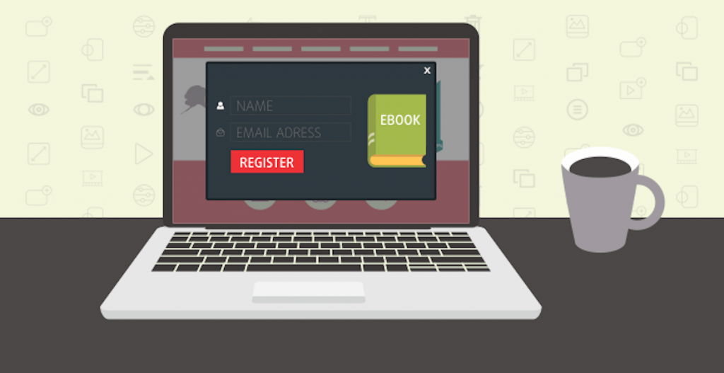
Before we launched our exit pop-ups we found out that many of the marketers and designers have a problem with this marketing strategy: they can’t personalized them. Even if they have a few settings (add image/logo, edit text or insert e-mail forum), still they can’t change the size or edit when and where to display.
This is why I believe that Bannersnack Embed Option is a great way to create and set up your next exit intent pop-up.
And guess what, is as simple as a copy/paste embed code!
Today I want to show you 25 examples of exit intent pop-up banners that are doing a great job – even if we talk about the experience, the message or the design.
Are you ready? Let’s get to them:
1. ConversionXL


On conversionXL we can see a classic strategy – build your subscribers audience by giving them something for free. But if you look at their design, you will see that they want to capture your attention with a clever headline “Master the Essentials of Conversion Optimization“. And the funny fact is that if you don’t want to be the master, you can still suck at this and ignore the message.
Snackable Tip: The more you know about your audience, the better you can create a compelling message for them.
[Tweet “Know your audience. Build your message via @conversionxl”]2. CoolMaterial
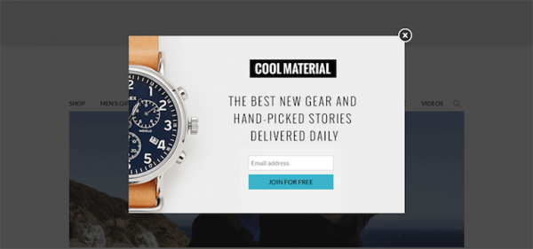
CoolMaterial is trying to capture the one’s attention with a simple but powerful exit intent pop-up. They also want to build their audience by telling them that they will deliver you every day in your inbox the next new gear and hand-picked stories. Also, just look at how the logo and the button is standing out of the crowd.
Snackable Tip: Don’t forget to align your pop-up with your branding. For more about the importance of a brand identity book you can check out this article.
[Tweet “Align your pop-up with your brand! via @coolmaterial”]3. Syedbakhi
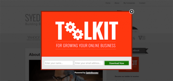
Syedbakhi is an entrepreneur who built several companies. Also, he is a quite prolifer blogger who wants to build his own mailing list by giving his audience a toolkit for growing their own online business. The most interesting thing in this pop-up is how colorful it is and how he played with the graphic elements in the “TOOLKIT” word.
Snackable Tip: Create something creative and memorable in your pop-up.
[Tweet “Pop-ups should be creative and memorable – just as @syedbalkhi ones”]4. Canva
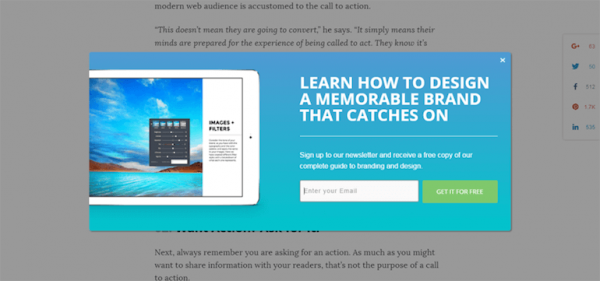
Canva is delivering great content every week in their design school project. And after you read the article and you want to exit their page, they remind you that you can stay updated with what they are doing by signing up to the newsletter. More of that, if you sing then, you get a free copy of their complete guide to branding and design for beginners.
Get Away Tip: This is a great way to start building your audience by giving them back something for free. Also, if we look at this exit pop-up you will see the difference colour of the button.
[Tweet “Build your audience by giving them back something for free as Canva does”]5. Heidi Cohen
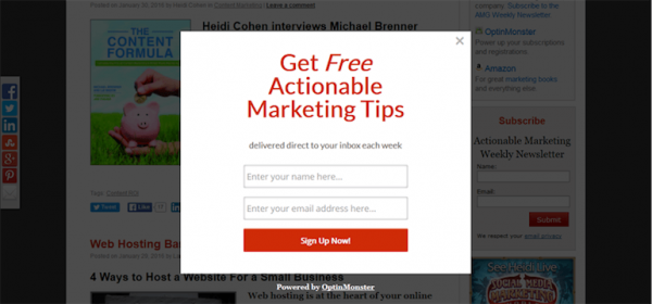

Another great blogger and speaker in the social media marketing industry is Heidi Cohen. So after you will read her articles and you want to exit her blog, you will get an exit pop-up that is telling you about her free actionable marketing tips. Simple design with 2 different colors, but the eyeball will stay on the major things: headline and button.
Snackable Tip: If you give something for free, just let them to know about it and what they need to make to reach it.
[Tweet “Use simple colors in your pop-ups like @heidicohen does”]6. Vulture
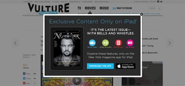

Vulture designed a more complex exit intent pop-up where they are telling the user to download their own app where they can watch videos, listen audio, read extras or see photos. Also, the headline is targeting only the iPad owners. A creative approach is the difference that is standing in the graphic element colors and also an example on how the magazine looks on an iPad.
Snackable Tip: If you want to make your reader to download your app, show them an example in your banner ad.
[Tweet “Show an example with your app in you pop-ups as @vulture does”]7. GQ
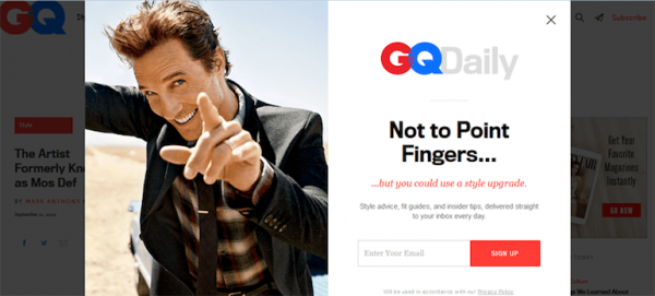

I wrote about GQ’s banner ads in the past days and now I’m getting back on their strategy about the exit intent pop-up for the blog. GQ is using humor and persuasive visuals to make you sign up in their newsletter address. I think that every man should have a GQ newsletter in their inbox, because we all need some style advice, fit guides and other tips to be a better man than the OldSpice one.
Snackable Tip: If you’re kind of worried for your users that they are afraid on how you will use their e-mail, you can make a Privacy Policy page and insert it in the pop-up.
[Tweet “Use humor and persuasive visuals in your pop-ups like @gqmagazine does”]8. Rafal Tomal
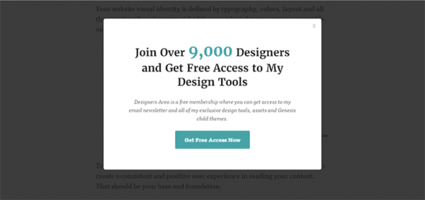

Do you remember Rafal Tomal? He is the lead designer at the Rainmaker, but also has a great blog where he is writing down tips and tricks on how to design great websites that convert. Also, Rafal have done some great side projects and if you will subscribe to his newsletter (which I personally recomend you) you will get access to all of his exclusive design tools, assets and genesis child themes.
Snackable Tip: Tell them about how big is your community!
[Tweet “Tell them about your community as @rafaltomal does”]9. SumoMe
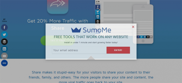

Sumome is a great app that helps you share your content with a social share tool for your blog posts. They designed an exit intent pop-up where if you give them your email address, they will help you instal their app in under 1 minute.
Snackable Tip: Simple and efficient, because your time is valuable and you need to grow every day.
[Tweet “Be simple and efficient with your message as @sumome does in their pop-ups”]10. WPMuDev
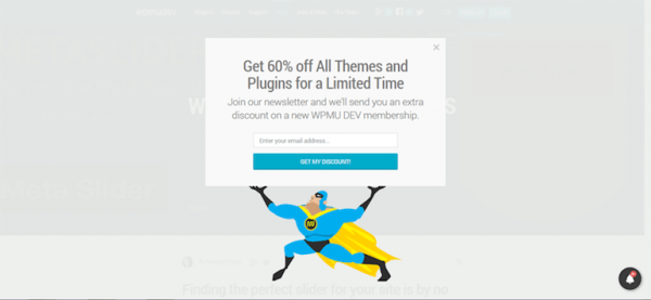

WPMuDev designed an interesting exit intent pop-up with a super hero carrying the power of a discount. If you fill in your e-mail and you subscribe to their newsletter, you get 60% of all themes and plugins for a limited time.
Snackable Tip: If you want to do something new with your exit intent pop-up, just design something interesting and let your imagination fly away.
[Tweet “Use cartoons in your pop-ups like @wpmudev does”]11. Jon Loomer
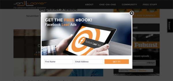
If you are doing Facebook marketing that means you already know who is Jon Loomer. But if you don’t, let me introduce you the specialist in advanced facebook marketing that you need to read it every time he is putting out there a content. On Jon’s blog you can see (after you want to exit) a pop-up with a free e-book about Facebook Lead Ads if you will get in his mailing list.
Snackable Tip: Design a simple pop-up and use your own brand color. Make it simple but impactful!
[Tweet “Make your pop-ups simple and impactful as @jonloomer does”]12. WPlift
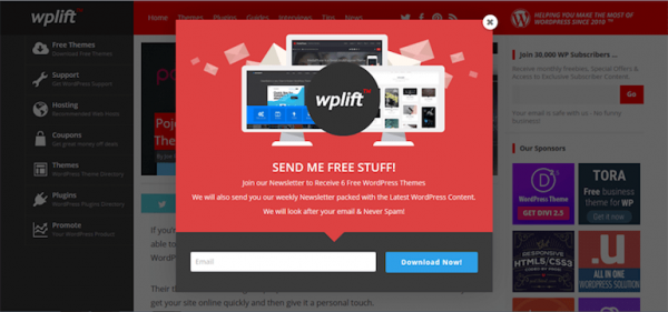
If you are a developer or a small business owner you should know about WPLift. Because they are the guys who will show you every month in a blog post the best free wordpress theme you need to know. Also, if you will subscribe to their e-mail list, you will get 6 free wordpress themes and also a weekly newsletter packed with the latest wordpress content. Do you see how important are the mailing list today and how many of these brands are doing it with their exit intents pop-ups?
Snackable Tip: Design your CTA button in a different color to stand out from the design.
[Tweet “Use a different color in your CTA buttons as @wplift does”]13. Hubspot
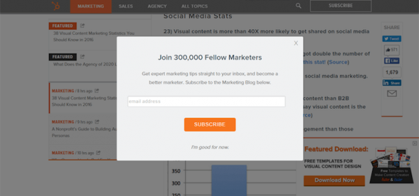
If you’re in the inbound marketing industry, it means that you already heard about Hubspot. They designed a pop-up with 6 simple elements: the headline “join 300,000 fellow marketers”, the text “get expert marketing tips…”, the place where you can introduce your email address, the big orange CTA button, the “No Thanks” message and also the “X” escape button. A great example on how to design good looking and converting pop-ups.
Snackable Tip: Give them a second possibility if they don’t want to subscribe to your e-mail list, or get your free content. So don’t forget about the [X] mark or a simple message as Hubspot have done “I’m good for now”. Also, including the number of people who read or are subscribed to your mailing list is reassuring the audiences their are getting into a trusted company!
You might also like: if you’re looking for a pop-up tool, check out HubSpot Pop-up Forms – works on any website, no coding needed to install it, and it’s free.
[Tweet “Don’t forget about the escape element in your pop-ups as @hubspot does”]14. CrazyEgg
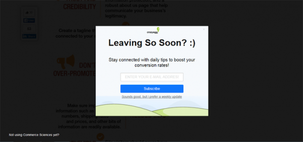

Do you remember that moment when you are at your friends house and you leave earlier that they think you should do, so then you hear from them a familiar line “Leaving So Soon?” This is what CrazyEgg is doing with their exit intent pop-up, are getting you familiar with them and also are trying to be friendly by giving you a smiley face.
Snackable Tip: “Leaving so soon” is an impactful message as it tells the user that your company really cherishes their presence.
[Tweet “Get the user familiar with your brand as @CrazyEgg does”]15. DigiDay
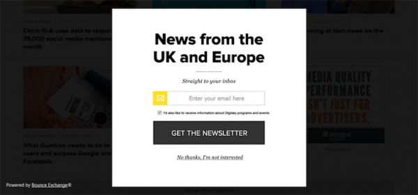
I read DigiDay every day and also I wrote about how they designed their banner ad on their platform. But here I recommend you to see how these guys designed their own exit pop-ups where they want the audience to get the news from the UK and Europe straight in their inbox. I love the big grey button that is delivering a simple message “Get the Newsletter”.
Snackable Tip: The simple layout of the colours, which uses only white, black and yellow is a compelling combination in advertising, and yes black & yellow does make you stay and buy.
[Tweet “Simple layouts and compelling pop-ups are professional and do convert – ask @digiday”]16. Jonathan Fields
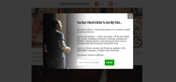
Bloggers also use this kind of strategy to build their mailing list. If we look at Jonathan Fields blog you will see a long written pop up where he is inviting the user to get to know him better while he is traveling around the world. I like this example for 2 reasons: 1 – because he want to be different so he wrote a quite long pop-up to create a context with the audience and 2 is the CTA button with a simple message “I’m in”.
Snackable Tip: Don’t be afraid to tell your story even if it’s long. People who want to follow you will stay with you. You give quality, not quantity!
[Tweet “Learn from @jonathanfields how to tell stories in your pop-ups”]17. Quick Sprout
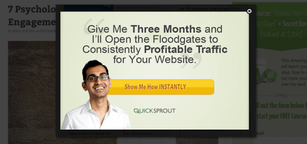
This is an old exit pop-up from Neil Patel’s blog Quick Sprout where he is selling his services by using his own personal branding elements and also by showing the reader that he is behind the Quick Sprout brand. Do you see that in the headline he bolded 2 important things that his audience is interested? “Three Months” that means time, because time is money and today time is limited, and “Profitable Traffic” because traffic without conversion doesn’t mean anything in the marketing world, right? Also check out the message in the CTA button “Show Me How INSTANTLY” – an urgency moment to make the user click on it.
Snackable Tip: If you have strong personal brand, you can use your photos and create a trusted connection with your users.
[Tweet “Use your personal branding in your pop-ups as @neilpatel does”]18. Instapage
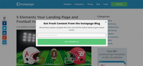

Instapage is another example on how to grow your mailing list by delivering great content and then tell the reader to subscribe to the mailing list.
Snackable Tip: Before you ask the user for something, first, give him something new and free.
[Tweet ” If you’re active and well-known, play your card with simplicity like @instapage and audiences will come to you”]19. Search Engine Journal
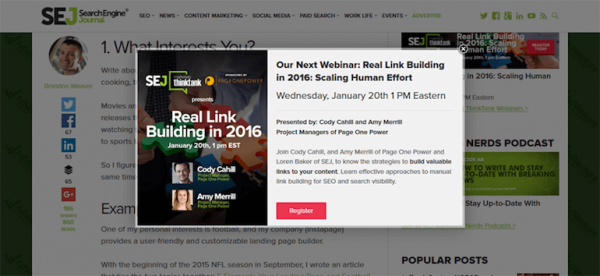
Are you in the SEO industry? That means that you already heard about SEJ and you are a member of them. I found it interesting how they designed their exit intent pop-up by telling the user about their next webinar. Just look at this design and see how many information you get on a banner, and still looks neat. You see the subject of the webinar, who will be there, what will you learn, the information about the data and also the 2 brands behind this webinar.
Snackable Tip: Show and sell your next webinar and make them register to it with a well designed pop-up.
[Tweet “Use a well designed pop-up to show your webinar as @sejournal does”]20. Optimonk
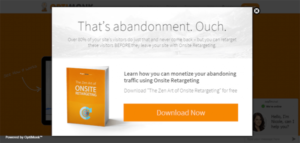

Do you have some interesting stats that your user might be interested in it? Create an exit intent pop-up, tell the information in short sentences and then deliver a great ebook where they can found more about it. A great example of how Optimonk is delivering their ebook for free about “The Zen Art of Onsite Retargeting” with a clever headline “That’s abandonment. Ouch”.
Snackable Tip: If you give an e-book and you have a great cover, just show it in your pop-up and create a “love at first sight” with your users.
[Tweet “Love at first sight with a pop-up? @optimonk levels it up to a sure conversion”]21. Newscred
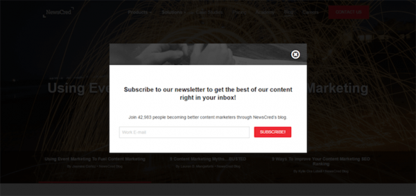

I know that you heard several times that you need to be transparent with your brand. But how transparent? Well, what about to tell them about your communities number? How many are them? Just like Newscred that designed an exit intent pop-up where they are telling the user that he can join the 42,983 content marketers mailing list. Another example on how to build your own audience – tell them about your members.
Snackable Tip: Notice the color of the button – red. Now look at the pop-up and see where else you can find red. Exactly.
[Tweet “Use different color in your CTA button as @newscred does in their pop-ups”]22. Gleam
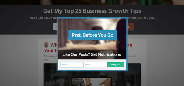
If you are not so good in words than use as little as you can. Be more human and make them notice the pop-up, read the message and subscribe to the e-mail. Just like the way as Gleam are doing it. “Psst, Before You Go” we can be more closer friends. Just sign up to our newsletter and that’s all.
Snackable Tip: Use simple Call-To-Action words that are easy to read!
[Tweet “Psss! Did you see how @gleam is using words in their pop-ups?”]23. Marketizator
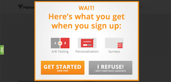
If you don’t want to be transparent with them or if you don’t want to make them download an ebook, just tell them want will they achieve if they sign up to your newsletter. Just like the way Marketizator have one with this pop-up. They claim that if the user signs up he gets 3 things. And if they are not interested, well…that means that they just don’t want more customers.
Snackable Tip: The call to action button is in a lively colour that really makes you convert, while the “I refuse” button is in a grey shade that basically makes you not even see it in the pop-up.
[Tweet “Convert with your pop-up by using this example from @marketizator “]24. Unbounce

Maybe you have somebody in your team that is talking every year to several big conferences? Maybe you have a great blogger or even your founder or CEO is a great name in your industry. Tell the user about him and if you have also an ebook that he wrote, that’s better. This is the way Unbounce is building their mailing audience, by telling them about Oli Gardner, the ebook and what they will get if they will download it.
Snackable Tip: Create a bridge between your user and the author of your ebook you want to give it for free.
[Tweet “Learn from @oligardner and @unbounce how to create a bridge between your brand and your users”]25. Tim Ferris
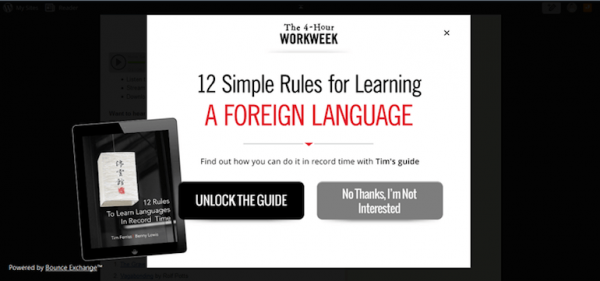
I believe in the power of a well-designed pop-up showed at the right time in the right place. This is what Tim Ferris is doing with his “12 Simple Rules for Learning a foreign Language” ebook. Before you will click the exit button from his blog, he will show you how you can learn another language in record time.
Snackable Tip: The elements in your pop-ups don’t have to stay only in your rectangle. Be creative and play with them!
[Tweet “Play with visual elements in your pop-ups, as @tferris does with his ones!”]Conclusion:
Here are 25 examples on how to design, deliver and create great pop-ups that will convert and grow your audience.
How to create exit intent popup on your website?
-
- Think before your audience and then to your brand
-
- Give them something for free before you ask their e-mail address
-
- Show it at the right time in the right place
-
- Give them another possibility to exit if they just don’t want to be in your community
-
- Don’t forget about your brand identity rules
- Use a different color for your Buttons and CTA words
Did you know you can create exit intent popups with Bannersnack? Check out this video

Now back to you, what are the most important things when you design an exit intent pop-up?
