

Heatmaps are the new black — and my favorite joke about it is that at a bar I would love to have a heatmap to see who is looking at me, when and where specifically. But in advertising and marketing – oh, boy!
Pure gold on the table — and I know if you’re here, you’re about to get so much better at heatmapping.
Tracking eye movement can give us fascinating insights into advertising and design and reveal a few things about human tendencies.
But what if you’d want to use these tendencies to promote your product or see how consumers behave?
I am a visual person, and you can buy me with just one image — if you prove it’s the right one. The proof part comes quite easily since we live in a digital world that gives you thousands of opportunities.
So to understand how to read the heatmaps, I’d like to take you on a journey that would give you a bird-eye view and some tricks to use heatmaps for your best campaign to come.
Ready? Steady! Go, heatmap warriors!
What is a heatmap?


No boring stuff on the table — but let’s start with the basics. What is a heatmap?
A heatmap is a two-dimensional representation of data in which values are represented by colors. A simple heatmap provides an immediate visual summary of information. A more elaborate website heatmap allows the viewer to understand complex data sets.
The definition is a boring one (yawn!) — let’s admit it. But if you’re just as visual as I am, a heatmap speaks louder when you see it. No matter the way a heatmap is represented, there’s one common thing for them all — it uses colors for representing the data.
I’ll be Captain Obvious and point out that the weather forecast map is a heatmap and turning tables — you can use that one in your marketing struggles.
In marketing, we’ve got this simpler and way more helpful definition coined in Digital Marketing Glossary:
A heatmap is, in digital marketing context, a visualization map allowing to see where and how visitors interact with a webpage. The brighter or hotter an area is, the more interactions there are. Red areas are the areas with the most interactions and a cold color like blue marks areas with less activity.

Brighter and hotter areas are the ones that your customers see first and interact with, while blue and green are the ones that have the goal to stay in the background, complementing the red areas.
On the same page, so far? The fun part just starts!
Why start heatmapping?
The marketing strategy without metrics is called spending marketing strategy. So, it is imperative to have control over how your marketing strategy develops and what color is the interaction you have with your audiences.
I know my eyes are beautiful — do you know what is the sexy thing that makes your audiences love your web page, tool or banner ad?
Here’s where the heatmap comes in and some points to convince you about it:
1. Love at first sight: Your visitors don’t have all the time, so their judgement is based on what they notice first, so make that first-noticed-thing worth noticing;
2. Banner blindness or website blindness is much easier to control — thanks to heatmaps you now know what people avoid, and have a second chance at repositioning and making the right choice to bring that upfront.
3. Valuable metrics to prove your ad, marketing or any kind of spending. When you know where the mistake is, you can fix it, learn from it and convert more in the future.
The F word is for the F-pattern
![]()

Since there are approximately 2 million blog posts posted daily of new blog posts and over 1 trillion pages across the web — we’ve got some reading to do. And the human brain said “How about NO?” and developed an F-shaped reading pattern.
Well, now that we know, there’s a 3-step plan to beat it:
- Stop dreaming that your users read thoroughly – give them clean, clear and straight to the point content;
- First two paragraphs are crucial — engage, explain and be consistent, so you can get them read it all.
- Subheads, paragraphs and bullet points to easier scanning. You’re still with me, right?
People incline to view the left side of the screen far more than the right.
![]()
What to Track with a heatmap?
Depending on your goal, when choosing a heatmap tool, you’ll have to go after one of the three options. It is as easy as 1-2-3:
1. Eye tracking tools help tell you where you’re visitors are looking. How do they do that? A lot of research has proven that eye movement and the mouse movement are highly correlated. Mind blowing, isn’t it? And this can help you monitor which part of your design is appealing and where you could possibly insert a CTA or more information — for a better experience for your visitors and better conversion for yourself.
2. Click tracking tools are a gold mine because you can immediately see what works on your page and what doesn’t. The click can happen on a button, link, image or a piece of text that looks like a link. The magic lies in the fact that you can act immediately by inserting a link or CTA where people click the most, or you can take it out if this is not part of your plan. Sometimes, indeed, an image or a piece of text can be a more attractive CTA than your actual CTA button. Without a click tracking heatmap, you wouldn’t know!
3. Scroll heatmap show you how visitors scroll on your page. We know that below the fold is not so important, but how do you grade that? A scroll map helps you learn what kind of behavior your visitors have — do they spend most of that time on top of the page, middle or do they go all the way to the bottom of your page.
[Tweet “Eye, gaze, click, scroll and image tracking with heat maps – explained!”]Heatmaps in marketing
Heatmapping tools give you an image worth a thousand paper report. The map explains easier across your marketing team how your page or ad is working, what needs to be optimized and what is not working at all. With click maps you can see where people click on non-clicks parts and you can readjust that.
A. What people click – CTA
The Call-To-Action button or banner that you’ve installed on your website is not converting the way it should because there are a lot of other distractions and confusion about what is expected from the audience to do. Do people ignore it or click it somewhere else? You have your proof on your heatmap and there are two options:
- Make that red dot a click OR;
- Re-design it so it doesn’t look like a click.
B. Where people look — directional cues
In banner advertising it is not just a background image — it is a background image that helps your Call-To-Action come upfront and do its work.
And here I would love to talk about science, because Fitt’s Law is actually proving a point that the act of pointing — with the eyes, touching an object, directing with the finger, an arrow or with the gaze of others – is an innate behavior of humans that still works perfectly in advertising.
And a lovely A/B testing with a heatmap — to prove one thousand words with an image:

Tools worth a million heating devices
The theory is on, how about practice? Further on I would like to give you some useful tools you can start exploring the efficiency of your website, visuals and banner ads.
As there are hundreds of options across the web, there’s three tracking ways you can use them for:
1. On page
2. In-app
3. Visual ad
On page tracking options are so many, it would be unfair to talk only about one. The most popular on the web is Crazy Egg, but you can find other great options, too. For in-depth heatmap data you can use Inspectlet, ClickTale or Lucky Orange. Also, you can specifically add a heatmapping tool like Mouseflow or Seevolution to track the clicks visitors do.
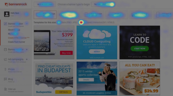
In-app tracking is the one thing we love at Bannersnack – we can see how our users interact with the banner maker tool and where they have difficulties. For example, we’ve observed that there was a lot of hovering activity around the ‘More’ button in our Editor’s bar. The change was obvious — we had to improve the UX by having a full format bar.
The app that we used is Hotjar, and you can have a live video of the activity of your visitors.

Visual ad tracking is another option I simply cannot keep for myself only. As HTML5 makes its way into the world, there are a lot of visual ads that are directly integrated into web pages or blog posts. We can call them adds, in-page images, banner ads — you name it, but their goal is the same. So, as content creators need to advertise their pieces of content or services, they also have to see how the in-house banner works. What can help? A heatmap on your banner. How? Bannersnack Analytics is giving the option to see a heatmap report of what part of your banner is actually converting. I say you should give it a try and track your own advertising and improve it.

Wrap it up
Heatmaps were a miracle for myself when I discovered them – and also rocket science. But today, it is one of the most important things that I take care of.
All your marketing sweat is down the drain if you don’t use the right metrics – and I hope you’ll thank me one day for this heatmap lobbying!