Infographics are a great resource for a quick and clear piece of information for you to learn. Almost every week, your favorite websites create some awesome infographics that can be very useful and packed with great content.
We gathered in a list, some of the coolest infographics for designers that we could find and we structured them in a several topics.
A. Design 101
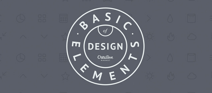
#1. 10 Basic elements of design
We begin with the basics. This infographic, as the title says, will explain some basic elements of design.
“Designing is more than inspiration or a great idea, it’s about understanding the fundamentals of the subject.“
Click on the image below to see a larger view:
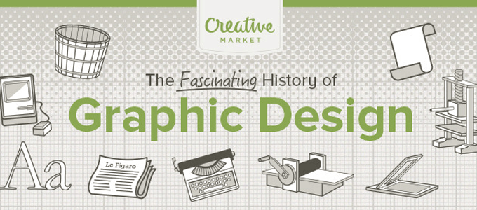
#2. The History of Graphic Design
From 15.000 B.C. to 2015, all the major design events and innovations covered in one great infographic.
Did you know that the first website was published in August 1991 and it was a simple, text-based page with plain left-aligned black text and bright blue links on a white background?
Click on the image below to see a larger view:
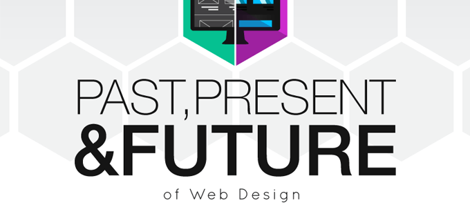
#3. Past, present, and future of web design
In the last 20 years, technology and the web culture web design changed radically. This infographic will walk you through all those important events.
Click on the image below to see a larger view:
B. Color Lovers
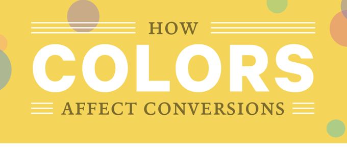
#4. How colors affect conversions
If you are designing banners or any other advertising material and you want more conversions, this is a must for you. You will learn how colors affect conversions and other tips and tricks.
Click on the image below to see a larger view:
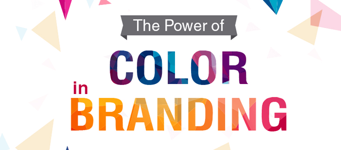
#5. The power of color in branding
There’s a lot to talk about when it comes to branding. Colors are sometimes the defining element of a brand so you have to choose it wisely.
Click on the image below to see a larger view:
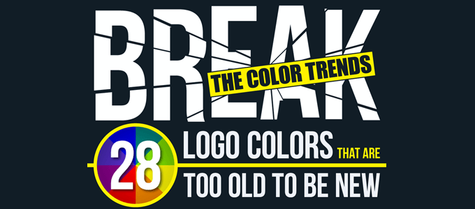
#6. Break the color trends: 28 logo colors that are too old to be new!
A green Mcdonald logo or an orange Twitter might sound weird but this is how Designmantic envisioned some famous logos with a new facelift.
Click on the image below to see a larger view:
C. Fonts and Typography
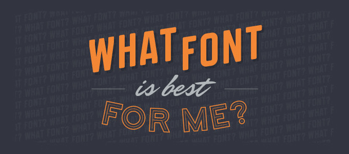
#7. What font is best for me?
The best answer to this question is “Not Comic Sans!”. Designers love fonts and we don’t blame them, but sometimes, choosing the right font can be tricky.
Click on the image below to see a larger view:
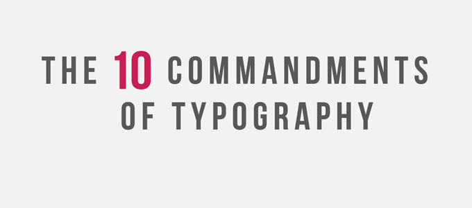
#8. The 10 commandments of typography
Typography is a powerful tool but there are some rules that you should follow. In this infographic, you will find out how you can combine a sans-serif font with a serif font, why the contrast is the key and what font you should avoid in any circumstance.
Click on the image below to see a larger view:
#9. The art of combining fonts
Combining two fonts sometimes can be a real pain. There are no rules for combining font but there are lots of best practices to follow. Here are some of them.
Click on the image below to see a larger view:

D. Work Smart
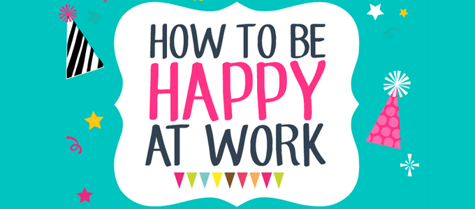
#10. How to be happy at work: 10 simple tips that work
Your work efficiency and performance is most of the time influenced by your happiness. This infographic will give you some pieces of advice for a happier life at work.
Click on the image below to see a larger view:
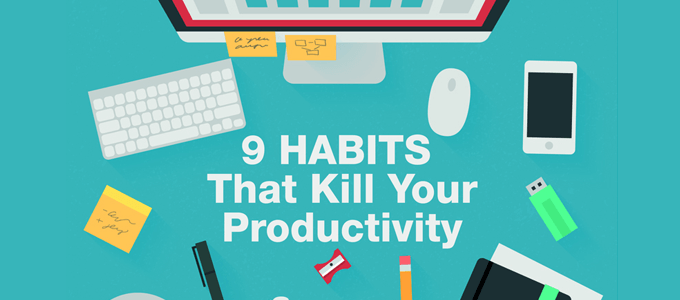
#11. The not-to-do list: 9 habits that kill your productivity
I have to confess that i found myself doing some of these habits and I think the worst is frequently checking emails. All these habits are time consuming and unproductive. You must try to avoid them.
Click on the image below to see a larger view:
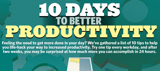
#12. 10 days to better productivity
Did you know that smelling a lemon improves your brain activity? Or did you hear about the POMODORO technique that can save your time? For more tips to help you increase your productivity check out this infographic.
Click on the image below to see a larger view:
E. Designers Struggle
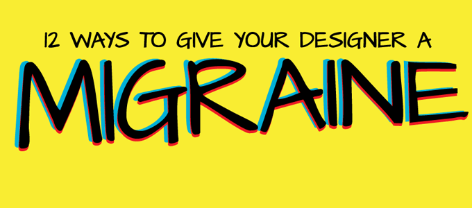
#13. 12 ways to give your designer a migraine
Sometimes, clients can drive designers crazy. Questions like “Can we use Impact instead of Helvetica” makes the designer rage quit. Here are some others ways to annoy a designer.
Click on the image below to see a larger view:
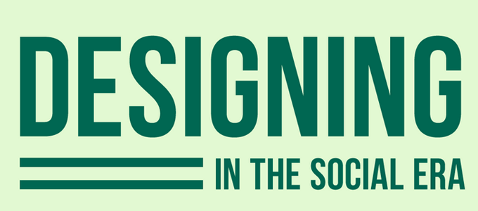
#14. Designing in the social era
Designers like to share their work and their latest achievements. How to get noticed on the main social platforms, and other related tips in one infographic.
Click on the image below to see a larger view:
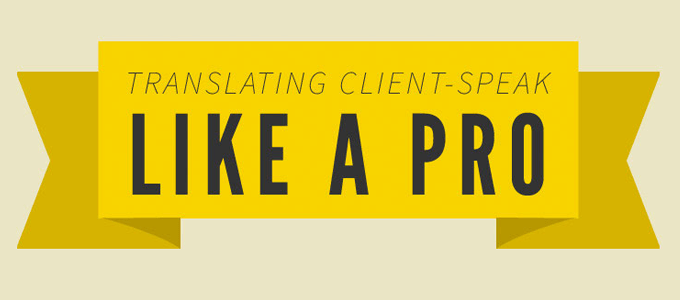
#15. Designer’s guide to what clients really mean when providing feedback
Sometimes there is a barrier between the customer and the designer. Good communication is the key to successful design projects. Here are some phrases that a customer might say and their actual meaning.
Click on the image below to see a larger view:
#16. Bonus
This recommendation is a bit off topic but we know that you guys will love it. In this interactive guide, you will discover 72 amazing facts about your favorite brands and also what is their hidden meaning.
Click on the image below to see a larger view:

If you know a cool design-related infographic, feel free to share it with us in the comments.
ایکیا
August 29, 2017Awesome info graphics, thanks for sharing.
نرم افزار CRM
February 2, 2019Some really prime posts on this web site , saved to my bookmarks.
طراحی وبسایت وردپرسی
March 3, 2019thanks alot for your sharing . it was so great and useful .
مشاوره حقوقی
May 11, 2020I’m pleasure to read this, thank you for sharing, good luck.