2015 was the year when the “content marketing” or “native ads” or even the “flash is dead” were the most used terms in the digital marketing industry. Oh yeah, and let’s not forget about the cliche “banner ads are dead”
I’ve heard a lot of talking about why banner ads are dead and why we have to take other forms of advertising into consideration. When I have talked with other specialists and asked them to tell me 3 valuable reasons why they think that banner ads are dying, they mumbled something about CTR, creativity and social media ads.
Well, my friend, let me tell you something. Banner ads are not dead and they will not die in the near future.
[Tweet “The Banner ad is just reinventing itself.”]
Only those who know how to use the 2 major elements of it, creativity and media placement, will get the entire idea.
Like Chas Edwards said:
We’ve been putting the wrong stuff in the rectangles and blaming the rectangle.
Let’s talk a little about the word “stuff” in this quote. How can we change the “wrong stuff” into the “right stuff” or, even better, into the “best stuff”?
Last year I started a personal project that has something to do with the banner ad design industry – I analyzed from a designer’s point of view thousands of banner ads from different companies and publishers/bloggers. I saved them into my computer and created a few hundred folders with banner ads.
Why did I do this? Because I wanted to see how designers are creating these banner ads and what type of design is standing out from a website.
Next, I want to share with you my 4 tips on the trends in the banner ad design area.
1. The “stand out” creative image
What is the main purpose of an ad? To create awareness and to attract people.
Now let’s get back to the banner ad – one of the main reason of a banner ad is to be noticed online, to make the user click the button, right?
But how can a banner ad be noticed on a webpage when the entire display is crowded with content and other visual formats? With creativity and quality.
What is creativity in advertising?
Ads with a high level of artistic creativity contain aesthetically appealing verbal, visual, or sound elements. Their production quality is high, their dialogue is clever, their color palette is original, or their music is memorable. As a result, consumers often view the ads as almost a piece of art rather than a blatant sales pitch. (source)
Unfortunately, other designers and advertisers forgot these 2 elements and they’ve done terrible ads which led to the banner blindness.
[Tweet “A good looking and creative banner ad will always stand out on the web.”]
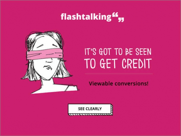
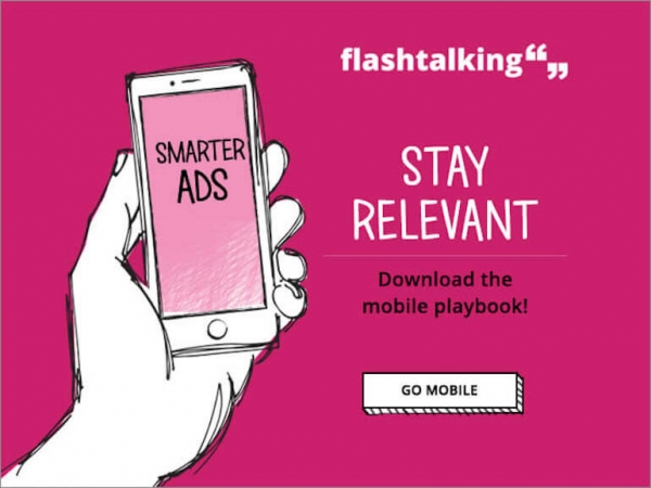
These 2 banner ads from “Flashtalking” have shown me a simple approach on how to design a banner ad, with comic elements, such as the main image and the CTA button:
Also, if we look at these banner ads we see that they used only 3 main colors (white, black and pink) and they used the same design style but with different texts, visuals and buttons.
Another interesting banner ad I saw was on Red Bulls’ content platform redbulletin.com where they used different dynamic images with their cover stories.
Creativity is an important element when you design a banner ad. Don’t just throw there some elements and expect something big to happen.
Make the best from your banner ad!
2. Less is more
There was a german-born architect and educator, who is widely acknowledged as one of the 20th century’s greatest architects. He helped define the modern architecture. He goes by the name of Ludwig Mies Van Der Rohe and he is famous for the next quote I want you to remember:
Less is More.
Now let’s get back to our discussion and talk a bit about branding.
Because here is the point where we have to understand the power of a well built brand and why banner ads will help your brand awareness.
MailChimp is one of the best examples I have when it comes to the “less is more” theory regarding the banner ad design structure. Just look at the next banner ad and tell me what you see.
Do you see a CTA? Do you see a value proposition? A high quality image with a person and a laptop? No. You only see the MailChimp logo. A simple, clear logo on a yellow background. Because their logo and name tell it all. You know that it has something to do with email marketing while the “chimp” word will let you think about something different, maybe something crazy enough to click the banner ad.
But MailChimp is not the only brand who uses a simple banner ad without any other elements.
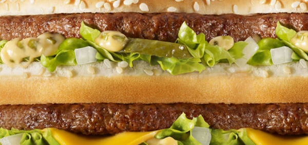
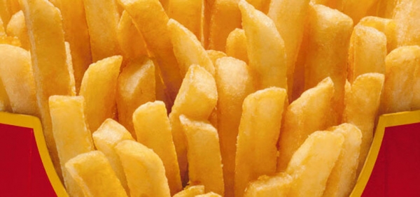
McDonald’s launched a banner ad campaign by showing this:
A simple banner without any other logo, CTA or happy family eating a meal. It’s only a matter of branding in their product.
I know, Mail Chimp and McDonald’s are big enough brands to do this, but that doesn’t mean that you can’t follow their example.
Just start the marathon by building your brand, investing in it and by creating a faithful community that will be there and that will recognize your brand.
“A brand for a company is like a reputation for a person. You earn reputation by trying to do hard things well.” via Jeff Bezos, CEO of Amazon.com
Sometimes “Less is more” will be the answer to your white space, to your copy or to your image.
3. Stand out by using colors
Working with colors is fun. In fact, this is the most interesting part of the work because there are tremendous variations you can create with them.
Talk with a graffiti artist about colors and you will see how important they are. Talk with an illustrator and he/she will tell you that colors matter the most. Talk with a brand designer and he will explain to you why the ghost from Snapchat is on a yellow background or why Facebook chose blue as their brand color.
[Tweet “Researchers found that up to 90% of snap judgments made about products can be based on color alone.”]Do you see how important colors are in this world?
Now think about this in terms of banner ads. Beside the conversions’ part and other digital advertising situations, let’s see how we can use colors in our banner ad.
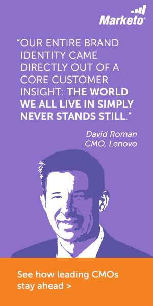
The first example that came into my mind is Marketo, which is using color in this way:
Just look at how they played with the colors in their banner ads, how they used the background color and how they created a person’s face with other colors. It’s interesting and definitely will make the user look at this banner and click on it.
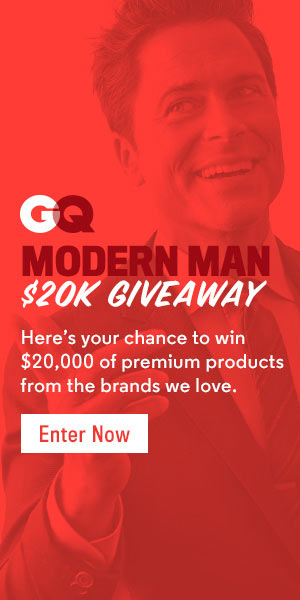
Also, if this is a little too complicated for you, you can still create a colored background and still have a “main topic” on your banner ad.
Check out how GQ is doing this trend:
You can also do this with our banner maker, just insert an image and then add a shape -> choose a color -> scale the opacity to 90% or 80% and voila.
Play with colors and find the best way to create a piece of art with your banner ads that will make the user to click on it.
4. Use media elements in your banner ads
Even if you can’t insert different media elements in your banner ad and display advertising, that doesn’t mean that you can’t design a banner ad for your blog/website or for your clients’ project and insert media elements in it.
Think about that: how would it be if you could design a banner ad where you could insert, in the most easy way, a countdown with a professional CTA button?
Well, this is possible now with our newest feature Smart Embed Object with a simple copy/paste embed code into our banner ad.
We have got you covered with Social Media Elements, Media elements and of course, e-commerce platforms. Just think about this: the future is here and soon you will be able to buy a product directly from a banner ad. Or, isn’t this the reason why Pinterest works with “buy pins”? Yeah, it is.
Conclusion
Banner ads are not dead, but they have got a new style and a new way to communicate with the user. Use these trends and make the best of your banner ads.
If you have other tips and tricks about banner ad trends, just leave us a comment!







Matt
January 8, 2016Thanks Robert for the insightful blog. Will definitely be considering the points you raised when creating our next banner ad.
Robert Katai
January 9, 2016You welcome Matt. Let me know how your banner ads will work after considering these trends!
Harry
January 12, 2016You have mentioned some amazing design trends for stylish banner in future. Bookmarking this link!! Thanks Robert for sharing this post :)
Robert Katai
January 22, 2016You welcome Harry and thank you for reading this blog post:) If you have any other question, let me know!
پارتیشن
February 29, 2016thanks Robert.
vishal patel
March 6, 2016Good! I love the yellow and small design ideas; on the one hand it’s simple, on the other is so creative! Shows an interesting spirit of the owner for sure. Classified Advertising dubai
Douglas
June 24, 2016Nice post. I will give this a try again. I tried coming up with some banners for my products but the results are nothing to write about. Thanks to the professional that helped me out. Saving me lot of stress and time to concentrate on promoting my product. You may check him out here https://goo.gl/UQnJlv Banners designed using the gradient tool and some great PS brushes also look good.
Michael Richardson
July 1, 2016Hii Robert
Very nice blog and I want to appreciate you for putting your effort to make this blog information so organised and relevant. The image you shown above is illustrated about the Advantages of banners in any field.
Brooke McAvoy
July 25, 2016I like your tips about designing a creative image on a banner like this. This is the type of thing that I’ve been looking to do, but I’m worried about creating something that is a little too creative. Sometimes, if you do it wrong, you could design something that seems like it doesn’t quite fit the business and, in it’s uniqueness, is forgettable. Do you have any tips for avoiding this specific problem?
Robert Katai
July 26, 2016Hey Brooke,
Start with the “Why?” question in your mind: Why do you want to design this banner? Why people will click on it? Why I need this banner for my business? And then go further and see what is the goal you want to achieve. I don’t believe that there is such a thing like “too creative”. Design for you audience first and then for your brand!
پارتیشن
November 9, 2016Great post, thank you for the tips.
Sienna Eskildsen
December 31, 2016If you’re driving to this landing page from Adwords, how would quality score be impacted by #2? I imagine not using any copy, or even using less than 30 words, would get knocked heavily by Google, right?
zoyoyayep
January 1, 2017WOW, another exclusive post about banner ad design trends. Thanks for sharing. As a designer, I really enjoy this tips.
Robert Katai
January 9, 2017You are welcome Zoyoyayep! I hope you found some interesting ideas and thoughts about banner ad design trends
Robert Katai
February 10, 2017Yes, I’m agree with you Martin. This is why we wrote this chapter in our Banner Design Academy – https://www.bannersnack.com/banner-design-academy/banner-design-color-advertising/
Martin Scurry
February 10, 2017Hello Robert,
Graphic design is about more that just “being pretty”. Color is one of the most key for selecting any sites because all of the depend on sites color combination so choosing best color combination is must needed.
Thanks
Regards Martin
Jignesh Prajapati
June 22, 2020Nice content using this blog.
Emily
November 26, 2020Thanks, Robert for this post and it is workable especially for the beginner and it would help to createmore create banners. Keep it up and thanks.