We see animated banners more frequently, we see people interacting with them. And we also see companies investing more money in making their ads more appealing to the audiences of Today.
There’s a misconception among people that ads are not effective. That nobody really reads them, that they are intrusive and that they cost more than they deliver. In fact, 54% of the users reported that they don’t trust the banner ads they see. This has nothing to do with the advertising industry but with how banners are designed. If users don’t trust what they see, it’s because some advertisers do not take into account the audience.
They do not think about what people want, how they behave and what types of content they consume.
There are several types of display adverts you can use, some of them are static while some are animated. Today, I am going to talk about the latter and try to guide you through the design process.
Display ads are growing in popularity
Display advertising has become over the past few years more popular than ever. As you can see from the following graph, there’s a huge increase in spendings when it comes to display ads. Search ads are still popular but they are no longer as trendy as the visual advertisements.
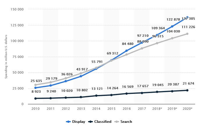
As a consequence, you have all the reason in the world to start your own campaign but once again, you are presented with some choices:
When it comes to displaying advertising design, the first choice should be on the type of the banner. On one hand, you have the static, basic banner and on the other hand, the animated banner.
This post is about animates ones and all essential things useful to create awesome animations without using any code.
Conversion rates differ based on the chosen type with a slight increase in performance for static banners. However, each campaign is different and each brand addresses its own audience. Moreover, considering that you are on this page, I assume you’ve already made your choice and the winner is the animated banner.
Now, what are the most important elements upon which the success of your banner may depend?
- Choose the appropriate sizes
- Choose your format
- Add color to you ads
- Select an appropriate typography
- Add your images
- Add transitions and other animation effects
- Ram up with graphic elements
- Don’t underestimate the White Spaces
- Compatibility with the network
- Feedback, insights and improve
- What are the sizes of animated banners for Google, Facebook, LinkedIn, Instagram and Twitter
- Conclusion

1. Choose the appropriate sizes
When you design your advertising banners, it’s important to start on the right foot. Therefore, the first thing to consider is the sizes of your banners.
Each advertising channel comes with its own requirements in size of the banner ad. Fortunately, our design tool allows you to create an entire set of banners, which includes all standard formats and of course, several ad formats for social media channels including the most popular ones.
The most commonly used standard banner sizes are:
- The 250 x 250 and 200 x 200 px Squares
- The 468 x 60 and 728 x 90 px Horizontal banners
- The 300 x 250 and 336 x 280 px Rectangles
- The 120 x 600 and 160 x 600 px Vertical skyscrapers
- The 300 x 600 px Half Page banner

2. Choose your format
Animated banners are not all alike. In fact, there are several popular formats to choose from, such as animated gif, flash, and Html5. My recommendation would be to choose Html5 and I will explain why.
HTML5 versus other formats and why Html5 is better
As I have already mentioned how people of today consume more interactive than ever. Based on this fact, combined with the total visual advertising spendings over the past few years, it’s safe to assume that animated banners are the future. What types of formats are available out there and why choose one format instead of another?
GIF banners are still popular today. They seem to have been with us for almost forever but their age, finally, took its toll. In other words, they are outdated and inefficient. Back in the day, when internet connections were slower, animated GIFs were a great compromise for video playback. They were immediately adopted by marketers as well and we can still see a few GIF banners today if we search for them specifically.
However, the Internet user of 2018 has a trained eye for visuals. And GIFs are nowhere near the professional stylish look of a modern banner. They are limited by their own nature. They are limited by design. A standard GIF has support for only 256 colors. I am talking about an 8-bit channel.
Flash technology came with significant improvements on animations, quality and look but they lack in something that should never be ignored by a marketer: compatibility.
Like GIF, Flash has been with us for a while now and it’s also outdated. There are several versions available, they are not native to operating systems and most of all, they pose serious security threats to computers and mobile alike. Not being natively compatible means you need to install a third-party plugin in order to be able to run flash animations. Not to mention there are several smartphones producers that have already banned the plugin from their operating systems.
HTML5 does not have issues with quality and compatibility.
HTML code is natively supported by all browsers not to mention the fact that html5 animated banners are also mobile friendly. These animations run on every single device, without the need to install third party apps or plugins. They look better than GIFs, are safer than Flash animations and they are easy to create if you use the right tool.

3. Add color to your ads
Why color is important?
On one hand, we have the brand colors. These are important for consistency and compatibility. Keep them in mind, especially if you choose to include your logo on the banner. If colors of the banner and colors of the logo are mismatched, the entire look of your advertisement will be ruined.
Let’s take a look at a random banner in order to understand what consistency with the brand means when it comes to colors.
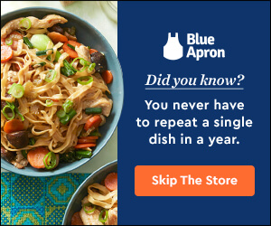
Half of the banner is based on Blue Apron’s branding colors while the other half features an exemplifying image of what their offer includes. The call to action button is visible and in a different color that matches the primary blue background.
On the other hand, colors can be used to trigger emotions. I am talking about positive emotions that capture the attention of the viewer without being annoying or intrusive. Also, colors can be used in relationship with the brand in order to emphasize certain products or add more elegance and style to your advertisement.
For example, black adds more elegance and mystery to a banner just like the following example from KIA suggests:
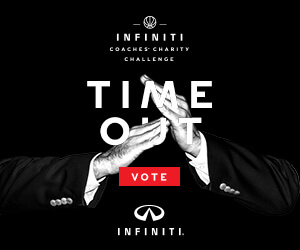
TIP: Whatever colors you choose, don’t overuse them. More colors do not mean automatically that the banner will be noticed easier, especially when you mix together very bright tones and nuances.

4. Select an appropriate typography
Fonts are important because they help you convey your message to the target audience. You need therefore to take into account not only the aesthetics of your choice but also the readability of the font.
Bannersnack includes several types of premium fonts you can use in order to add a personal touch to your banners. Moreover, you can upload your own fonts and give your banners a personal touch as well. What you need to know however is that there are three major groups of fonts and your design may depend on it.

First, you have Serifs and Sans serifs, the standard typography used for online texts. Secondly, you have “cursive” fonts. These are fonts that imitate handwriting, hence the name. And thirdly, there are “display” fonts which are rather decorative. They are used especially as titles or when you want to generate an instant effect on your audience without using other graphic elements.
Whatever your choice in fonts may be, an important fact you need to focus on is the readability of your messages and CTAs and of course, on consistency with the brand.

The above example comes from Kellog’s. As you can see, they use a basic Sans Serif font that is easy to read. It’s not a beautiful font, nor an ugly one. What it lacks in aesthetics it gains in readability.
The fact that it is colored to match the brand’s color adds positively to the banner’s look as well.
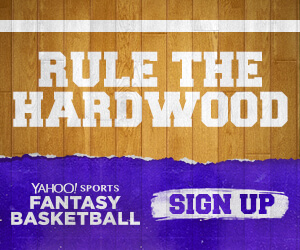
On the other hand, Yahoo! Sports decided to come up with a banner based on “display” typography to convey their message.
5. Add your images
Some banners include images while some of them, don’t. If you choose to integrate visual imagery on your banner, however, besides buttons, colors and typography, there are a few things you need to know.
There are three major types of images you can include in your animated web banners:
A1: Stock images.
There are many websites from where you can purchase great, professional looking stock photos. Or, you can choose from the gallery available in Bannersnack. Keep in mind, however, that good banners are not made with randomly selected images. You need something that fits the idea you want to transmit.
Here’s a good example of stock image use in this banner ad. It’s quite simple but at the same time effective.
A2: Product images.
Here, there are two main categories: simple product images and product placements. Be aware that you need really good images in order to make your point and convince you audience that your products are worthy of their attention.
Here’s an example of a simple product image.
Product placements means, however, a lot more. It means interaction with humans, images that depict the product being used or consumed, depending on its destination.
A3: Your own designs and doodles.
If you are working with an artist or, in case you have your own artistic skills, there are virtually no limits to what you can draw in order to capture the viewer’s attention. You can create your own branded drawings or, you can choose to be spontaneous and create something unique for every new banner you create.
B. Why visuals matter and to what extent?
If you are advertising products, images will help you show your target audience exactly what the products are and how can they be of use to them. Images may also be of help if you want to draw attention to your banner and convey not only a message but also a feeling, an emotion.
To what extent do they matter? Well, it all depends on what you are selling. You can create a simple animated web banner with just a CTA a still get it to convert better than a colorful banner. In order for the images to matter, they should be in line with your products/services, your company values and of course, your brand identity.

6. Add transitions and other animation effects
Before starting animating the slides of your animated web banners, there are three questions you may ask yourself:
- How to create smooth animation effects?
- How long should the animations be?
- How to animate banners quickly and with minimal effort?
In Bannersnack, you can add a “Build in” and a “Build out” transition effect to each element. The “build in” effect will mark the appearance of the slide and/or element while the “build out” effect will mark its exit. You can also make small adjustments on features such as duration and delay to each transition effect.
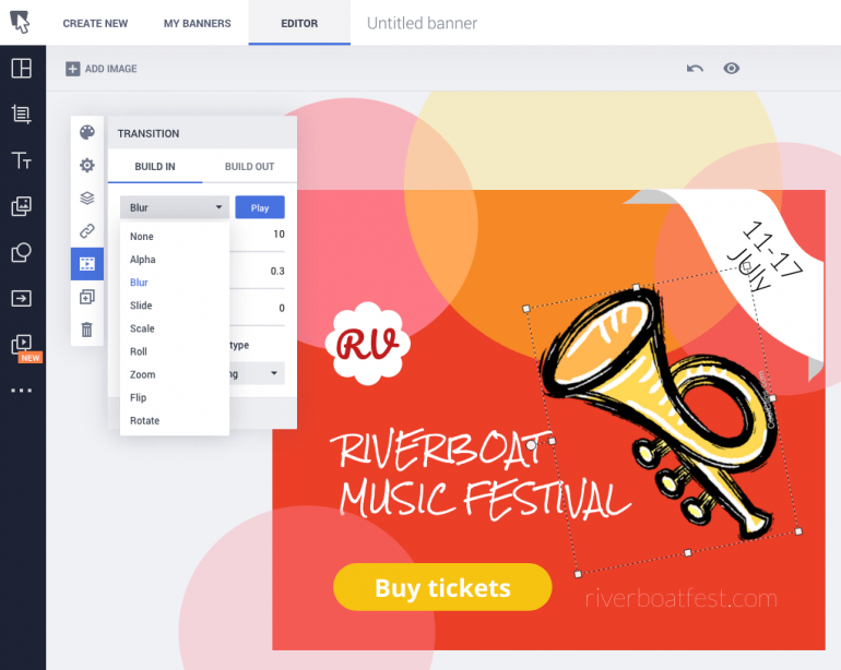
How long should the animations be?
Well, it depends on how many layers the web animated banner actually has.
You can add fast animations to more dynamic ads and longer effects if you want to add smoothness to an animated one or two layered banner.
Now, let’s answer the third question and then, we can move on to the next elements. Let’s suppose that you have little knowledge of animations and technicalities such as transitions, effects and so on. But, at the same time, you want an animated banner that can be ready to publish in just a few seconds. Can it be done?
Well, let me introduce you to Magic Animator, a great feature that is available in Bannersnack’s creation panel. Basically, it’s a one-click feature and it works great if you want to easily animate a banner in just a few seconds based on the 5 presets that are available here: Alpha, Bounce, Cross, Drop and Expand.
You just have to click on one of these animations, preview the banner and let the script work on its own.

7. Ram up with graphic elements
You manage to think so far about all the important elements of your banners but your work is not done just yet.
It’s time to think about all the small things that will complete your design such as the CTA buttons, the logo of your company or other buttons and graphic elements you might need in order to meet your campaign requirements.
TIP: While there are plenty of graphic elements you can use at this point, make sure you don’t overcrowd your banners with them. Keep it simple. In most of the cases, a logo and a CTA button will suffice.
8. Don’t underestimate the White Spaces
Finally, we’ve got to the last element on our list, an element which in fact is a non-element but it’s as important as any other of the previous ones.
Everybody says “content is king” and maybe, it is. When it comes to web banners (and not limited to), however, the way we choose to frame our content matters a lot. You cannot just randomly throw in texts and images, you need to make them visible and at the same time, make them fit together in a stylish and positive way.
White spaces are important in this context because they add to the banner by giving all its elements the necessary breathing space.
The need for a clean, easy to read look is a real thing. “White Space in design composition is the same as the use of Silence in a musical composition. Without the proportionate use of Silence, music is unstructured; some may call it noise.
Similarly, without White Space, design is unstructured and difficult to consume”

9. Compatibility with the network
Part of this chapter was covered when we’ve talked about the size and the format of your animated web banners. Apart from these two things, the length is also important and may be decisive on whether your banners convert or not.
I’ve mentioned previously that static banners convert better than animated banners. Do you know one of the other reasons they do it? It’s the length of the animation. So, if you want to make it compatible with your audience, you will need to cut it short. People do not have the patience to wait 20 or 30 seconds for your CTA to appear. You need to deliver your message in a shorter time.
What about compatibility with different channels and advertising platforms? Well, there won’t be any issues on this part, considering that you are using our tool. Bannersnack allows you to create full sets of banners that are compatible with all major social media channels and other advertising platforms, such as Google Adwords as well.
If you want to be informed on this matter, however, keep in mind that LinkedIn for instance, recommends a maximum of 15 seconds length for an animated banner while Google allows you to publish ads up to 30 seconds in length. On Facebook and Instagram, the recommended duration of your animated banner is 15 seconds or less.

10. Feedback, insights and improve
At this point, you know how to create your creative animated web banners and which elements to include in order to make sure they’ll be successful. Are these things enough? Well, they may be.
I said that it may, because not every campaign runs as expected, even if you make everything by the book. You cannot be sure until you look at your banner’s stats or until you get feedback from the audience.
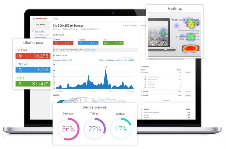
To this end, you can use Bannersnack’s analytics. The feature allows you to collect insights and stats of your banners and understand better how they convert.
Based on these stats you can later adjust your campaign and create better and more attractive animated banners and in the end, be more successful.
11. What are the sizes of animated banners for Google, Facebook, LinkedIn, Instagram and Twitter
Another important aspect you need to take into account is the size of your banners. Each advertising channel comes with its own recommendations. While Bannersnack has presets compatible with all the major channels, it’s better to know these recommendations before starting to design your banners.
It will allow you to have a clear view of how to add your different visual elements and how your banners will look like when they will be ready for publishing.
Most common recommended banner sizes on Google:
- Leaderboard – 728 x 90 pixels
- Half-Page – 300 x 600 pixels tall
- Inline Rectangle – 300 x 250 pixels
- Large Rectangle – 336 x 280 pixels
- Large Mobile Banner – 320 x 100 pixels
Most common recommended banner sizes on LinkedIn:
- Medium rectangle – 300 x 250 pixels
Most common recommended banner sizes on Facebook:
- Minimum Image Width in Pixels : 400
- Minimum Image Height in Pixels : 150
- Aspect Ratio Tolerance : 3%
- Aspect ratio: 9:16 to 16:9
Most common recommended banner sizes on Instagram:
- Minimum Image Width in Pixels : 500
- Aspect Ratio Tolerance : 1%
- Minimum Image Ratio : 4:5
- Maximum Image Ratio : 1.91:1
Most common recommended banner sizes on Twitter:
- Image width/height: Minimum 600 X 335 pixels
- Aspect ratio: 16:9.
Conclusion
Creating and designing animated web banners is now easier than ever, especially if you use an online tool such as Bannersnack which allows you to do it without knowing how to code or how HTML5 really works.
You can design art pieces of in just a few minutes, animate them and create successful advertising campaigns for your small business.
In order to be successful however, you need to know the main elements of a banner and which ones to include in yours, based on your goals, the brand you represent, the products/services you advertise. I have tried to be of help and explain the most important elements you need to take into account prior of designing your animated banners. There are also a few examples which will allow you to better understand how a successful banner looks like and why each of its elements matter.
You can also browse our list of animated web banners examples and find inspiration for your future work.
Are there any other elements you consider to be important for an animated banner?


Rogers Hornsby
July 29, 2019What about activating the button with html so it goes to my landing page?