Black and white is classic and timeless. In online advertising, beautiful black and white designs can grab customer attention better than colored ones. It’s the game of simplicity vs complexity or a white being more when emphasizing a product.
While everyone’s talking about the importance of colors in banner ads we decided to talk about the importance of… not having them! The topic we’re bringing to you today is somehow controversial.
Why? Because black and white, that are to be found at the two most extreme ends of the color spectrum, aren’t exactly the most popular colors (or non colors) when it comes to advertising.
Even though they’re not so often seen in banner advertising by themselves, but in combinations with other colors, black and white are chosen as brand colors by many companies. While white represents purity and innocence, black is often associated with wealth, luxury and sophistication and creates an air of mystery.
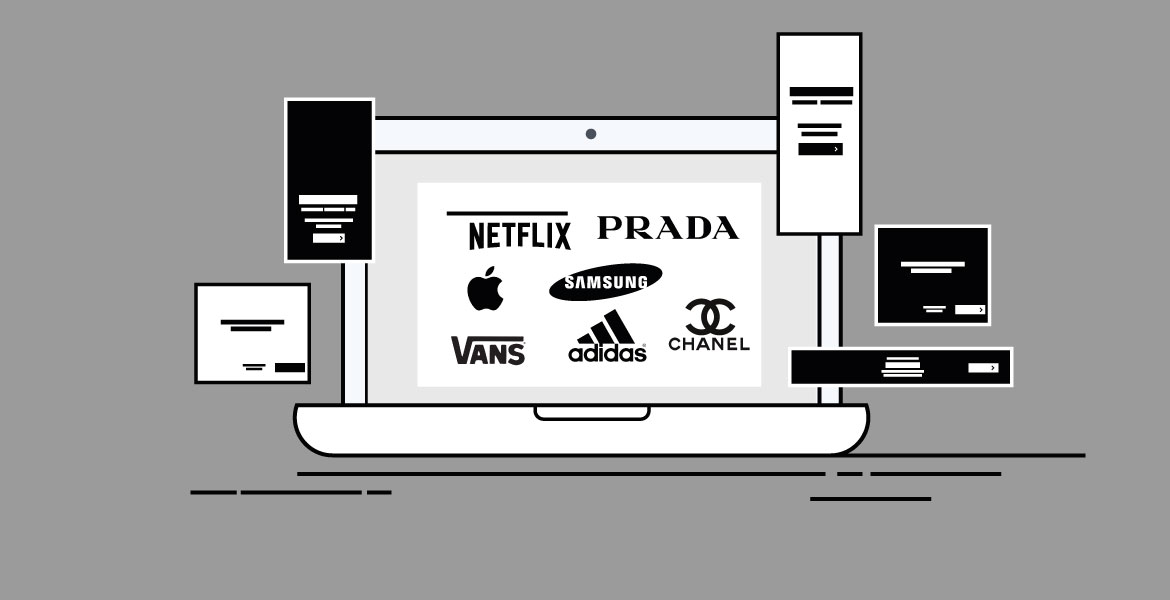
For this article, we made a research on what brands constantly use black and white for their creative web banners. Let’s take a look at some web banner examples from brands who decided to create their online advertisements in black and white!
In our research, we found out 2 main categories of brands that choose black & white as their colors for online advertising.
The first one is Media.
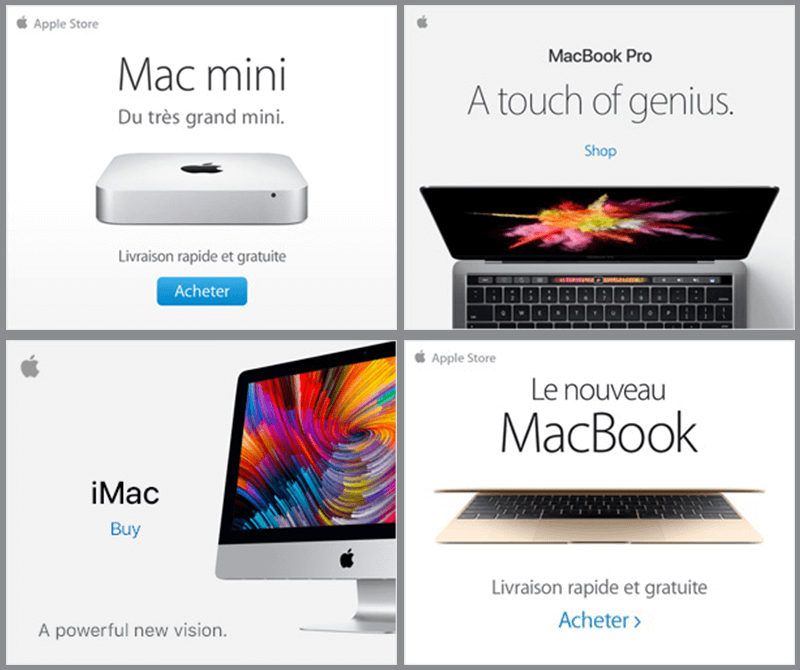
Apple reinventing the white
There’s no questioning whether this is the most popular brand using white in its branding. Actually, if we’re thinking about it, Apple made the color white popular! Apple’s design influence has gone beyond electronics and as BWM’s designer Sandy McGill, said in an article “The iconic white iPod and earbuds sparked demand for white automobiles. Prior to Apple, white was associated with things like refrigerators or the tiles in your bathroom. Apple made white valuable.” As we can see from the following web banner examples, white (and black in a little amount) is still being used as a primary color in Apple’s online advertising.
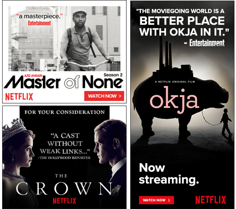
Netflix playing with black and white backgrounds
Netflix is definitely that brand that knows how to take advantage of the white and black space in a visual. If you’re thinking about Netflix you’re thinking about awesome series like Stranger Things, Ozark, House of Cards, Narcos or Black Mirror. Netflix easily plays with these two colors (black and white) and their trademark red which appears everywhere in their branding.
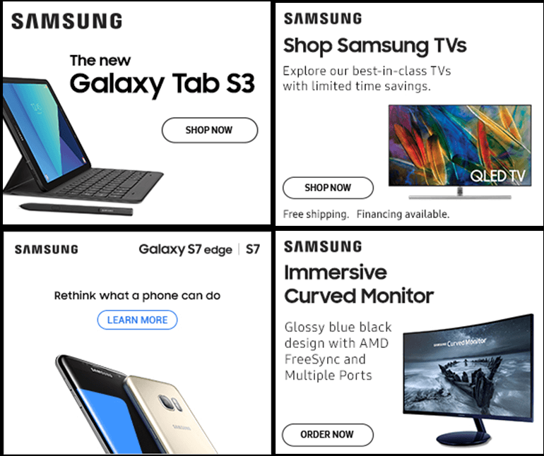
Samsung – just a touch of color on white banners
Samsung, as one of the biggest tech companies in the world, also uses black and white when it comes to online advertising. Since they want to emphasize their products in their Banner Ads, they take great advantage of the white space in a visual.
Check out the web banner examples below.
Spotify black banners
The digital music service’s brand color is the green we’re all accustomed to. You know, the one that got horrible feedback in the beginning but was later on accepted by the community. When it comes to online advertising, the brand goes on a very simple color line, using black and white and different versions of their logo.

The second category of brands mostly using black and white for its online advertisements is Fashion.
Adidas – stripes, trefoil, then bars… but always black and white contrast
Adidas is one of those brands well known for its use of black and white in any form of promotion.
From the insides of their magazine, to web banners, a majority of their work is based on these two colors.

Chanel
When it comes to high fashion, there are no better choices of colors than black and white. In this case, black is the representation of sophistication and luxury. Coco Chanel once said “Fashion is not something that exists in dresses only. Fashion is in the sky, in the street, fashion has to do with ideas, the way we live, what is happening.” Well, fashion is in the creative web banners also.
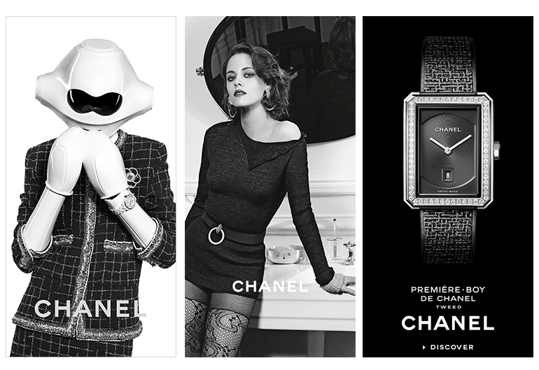
“Women think of all colors except the absence of color. I have said that black has it all. White too. Their beauty is absolute. It is the perfect harmony.”, Coco Chanel
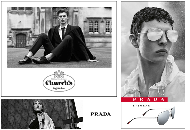
Prada using black and white images in their posters
Prada, the luxury fashion house, is well known for its powerful strategies that embody both fashion and contemporary art. Prada is not only selling expensive fashion, handbags, and jewelry, they’re selling a way of life and social status. Since in the last few years, luxury brands began facing the harsh reality that digital is an important component of a sales strategy, many of these brands started concentrating on creating user friendly websites and began being more active online through social media and banner ads. Prada also went black and white with their online advertisements and you’ll see from the web banner examples below that these color actually suit the brand and campaigns pretty well.
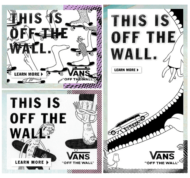
Vans – street style reflected in white ads with a touch of light colors on margins
This brand is one known as a symbol for alternative sports like snowboarding and skateboarding. Vans is the brand that took the outcasts and the rebels under its wing and sold them as champions. “Kids don’t relate to direct hard-sell advertising. They see through a company that’s just spending a lot of money to attract their attention. Our strategy is to ingratiate ourselves more into their lifestyle.” said the CEO Gary Schoenfeld to Inc. Magazine. Since their strategy is to stay close to teenagers, their style relating online advertising had to be in sync with that. The web banner examples we’re presenting to you below show some black and white comics that prove the fact that Vans wants to stay close to its audience.
Conclusion
In the end, we all know how critical color decisions can be in a business, but if black and white is what suits the brand you’re working for, what goes with the specific of what it’s doing, don’t hold back.
Sometimes black and white is bolder than strong colors! Let your ideas flow but don’t forget to take into consideration the audience!
Pundlik Jhadav
November 12, 2017Thanks for sharing this trick and thoughts.Helpful to me