More than 50% of the overall success of an online advertising campaign comes from the landing page used for the promotion. To put it more specifically, success/failure depends on how optimized the landing page is.
Mastering online advertising takes years, and above all, hundreds if not thousands of campaigns. Launching an online campaign is a team job, and it requires constant communication. From finding a creative concept to designing banner ads and then setting up a landing page, all the elements must be in-line with the main idea and objective.
Designing a banner ad is just not enough to have a great display ad campaign. You also need to build a great landing page. In fact, if you want a great ROI, building the right landing page for your banner ad campaign is crucial.
According to Marketing Sherpa, getting landing pages built and tested is one of the top five challenges faced by B2B marketers. And 48% of marketers build a new landing page for each marketing campaign.
But why are landing pages so important for banner ads? How can you create a landing page that can converts?
If you’re not a well-experienced marketer and do not afford to hire a whole team to get the job done, here’s a comprehensive resource to start building a highly converting landing page today. Skip a few years of testing and wasting money on lousy PPC campaigns, and learn from our marketing team everything you need to know to increase landing page conversion.
But first of all, what is a landing page?
A landing page is the first page that visitors see after clicking on your banner ad, search ad, promotional email or social media ad.
When is a landing page considered successful? When it drives good ROI. A great landing page will convert visitors into buyers and will get you significant ROI.
“Banner ads and the landing page should be in a solid relationship.” Click To TweetWhat is the objective of the campaign?
I saw many banner ads and landing pages that are not communicating the same message and don’t have the same objective.
For example, if I click on a banner ad that promises an e-book and I land on the page and the primary CTA is to buy their software, and the CTA to download the e-book somewhere else, the banner ad and the landing page are not in sync.
When you plan to launch a display ad campaign think about its objective.
- Do you want people to download an e-book?
- Do you want people to try your product?
- Do you want them to watch your video tutorials?
- Do you want them to buy your product with a x% price cut?
When you have a clear objective, it’s easier for you to design the banner ad and the landing page.
Who is your audience?

A landing page is made for a specific audience and for a specific occasion/promotion.
Many marketers assume their landing page addresses everyone on the internet. They couldn’t be more wrong. Each landing page targets a segment of internet users that have a specific problem/need. Your product solves that problem/need.
You can either promote a product, offer a special discount or free download of your latest ebook. Each promotion targets a special group of people and your job is to identify these persons’ characteristics and construct your landing page accordingly.
Understanding the user’s flow
When building a banner ad campaign, you must understand the journey of the user from the moment he sees your banner ad till the moment he clicks your button on the landing page.
- The banner ad is the first thing a person sees when he interacts with your campaign. It will either make him click or ignore your offer.
- If you’re lucky, and the user clicked your banner ad, he will get on your landing page. Here, he expects to find more information about your offer and expects the experience to be positive and quick. Maybe read a headline, another sentence and then click the button.

The reason you need to understand this flow is that you need to build your campaign coherently. Meaning that the landing page should be in-line with your banner ads: use the same visual, colors, message and branding elements.
The elements of a high-converting landing page
1. Design
If you cannot afford to work with an agency or a professional designer, you can use one of these tools to create a landing page:
In landing page design, there is one golden rule: less is more. You must remember that any landing page should be as simple as possible.
Let’s take each design element and see some best practices:
- Branding – both your display ads and landing page should have branding elements and employ your brand’s color palette. Your brand should be easily identifiable by any visitor who lands on your page.
- Images – Visuals are elements that can either capture attention or be a distraction if they are used excessively.
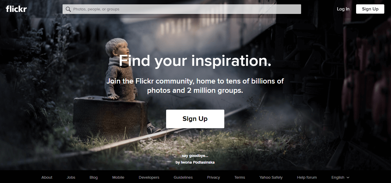
- Videos – some marketers prefer to use videos for their landing pages. According to Invodo, 74% of surveys showed that videos produce higher conversions than any other type of content, moreover, advertisers that used videos increased their sales 49% quicker than those that did not.
Here’s an example, from Luma, an intelligent Wifi home system.
- Whitespace – creates a visually pleasing effect and helps the user to identify the call to action.
- Fonts – test multiple fonts before choosing one for your page. Make sure it matches your overall design and brand.
2.Creative & concise copy
When you get to the copy part, just remember one thing: information architecture. Structure your texts in three sections:
- A headline
- A subheadline and
- a CTA button
The CTA is a crucial component in the structure of the landing page, as it is exactly this element of the design that makes the visitor take the corresponding action. It is possible to use multiple CTAs or accentuate only one CTA.
If you prefer a short-form landing page, then one CTA will be enough. In this case, it is not worth distracting people’s attention with a lot of requests. However, long-form landing pages are also considered to be highly effective. You just have to add each separate CTA at the end of each discrete section of the landing page in the proper place. You are the one who will decide what is best for your circumstances.
Let’s have a look at the Archbook responsive landing page template. This is an example of a long-form landing page with several CTAs, but even so, it does not overload the page and the actions are clear, as each of the CTAs is located after a certain section.
That way the user knows exactly what action he should take after each section. The buttons are big and offer only two options: the buying one is red, while the “Learn more” one is white with a slight red border.

Then, don’t distract people’s attention with too many calls to action.
A good landing page is one that promotes only one or two things.
Marketing Sherpa found out that 48% of landing pages contain multiple offers. Sometimes this can give a headache to the user that lands on your page. Keep your offer simple!
Stay away from general copy. Don’t just tell them how good your product is or how you will give them a better life through your service.
Maybe you want them to download your new e-book and you are focusing on getting email subscribers. Or, maybe you just want to give them a free trial of your software service. Is your request clear enough so they understand what you want from them after they got on our landing page?
Knowing the basic needs and goals of your persona might help you better understand the role that your product or service has in their life. And going further with this theory, it will be a helpful information on how to design an exceptional landing page.
3.Offer/Form
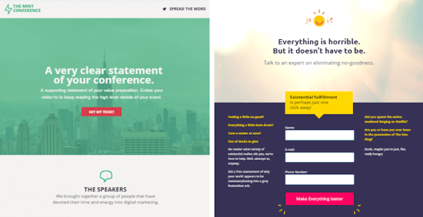
There are two types of landing pages: conversion landing pages and lead generation landing pages.
Conversion landing pages
These landing pages aim at prompting the visitor to click a button to either go to another page/resource of the website or to buy something. In this case, the landing page should be built with the offer/resource in mind, guiding users to click the button.
Lead generation landing pages
Companies use this type of landing pages to collect data about the visitors such as name, email address, company etc.. In exchange they offer something as a gift. It can either be an ebook, free webinar invitation or free tutorial.
If collecting information about your visitors is what you want, then build your landing page accordingly. Create a form and invite people to fill in the fields. Make sure you keep it as short as possible. People who landed on your page after they have clicked a display ad are not willing to spend a long time filling forms. You either use one field, two or three fields, at the maximum.
Another thing you should know: don’t ask personal questions such as “What is your country/city?”, “What is your position in the company?” “What is your birthdate?”.
Here’s an example of a conversion landing page vs a lead-generation landing page, from Unbounce:
4.Include reviews
According to BrightLocal, 85% of consumers trust online reviews as much as personal recommendations. With this in mind, ask your customers to give you feedback about your service. If you have some reputed satisfied customers, even better! Get their feedback and put it on the landing page. It will make your message more credible and trustworthy.
Important takeaways:
Visual and verbal coherence between your banner ad and the landing page
Both the banner ad and the landing page should have the same message and visual identity.
If you use a call to action on your display ad, the same message should be found on the landing page. The user expects to find the same offer or idea throughout your marketing materials. If you change the message, visitors can feel confused and bounce in an instant.
The same principle stands also for the visual identity. Use the same colors, images, and branding elements. Create the same recognizable atmosphere.
How to optimize your landing page for PPC
(landing page best practices)
- Keep your texts concise.
- Use a simple/intuitive architecture of the information.
- Offer the user only two options: bounce or convert.
- Make your CTA highly visible.
- Remove the sitemap, Social Media icons, site menu, and any other links that could distract the user.
- A/B testing – test multiple versions of your landing page before going live. Test to see how the colors, the images, headline, and CTA are performing.
- Dynamic texts – optimize your landing page for Google search ads with dynamic texts. What does it mean? Use landing page tools like Unbounce to match verbs used in Google search with verbs on your landing page button.
- Place your buttons above the fold.
- Track conversion in analytics and make the necessary changes accordingly.
Some inspirational landing page examples
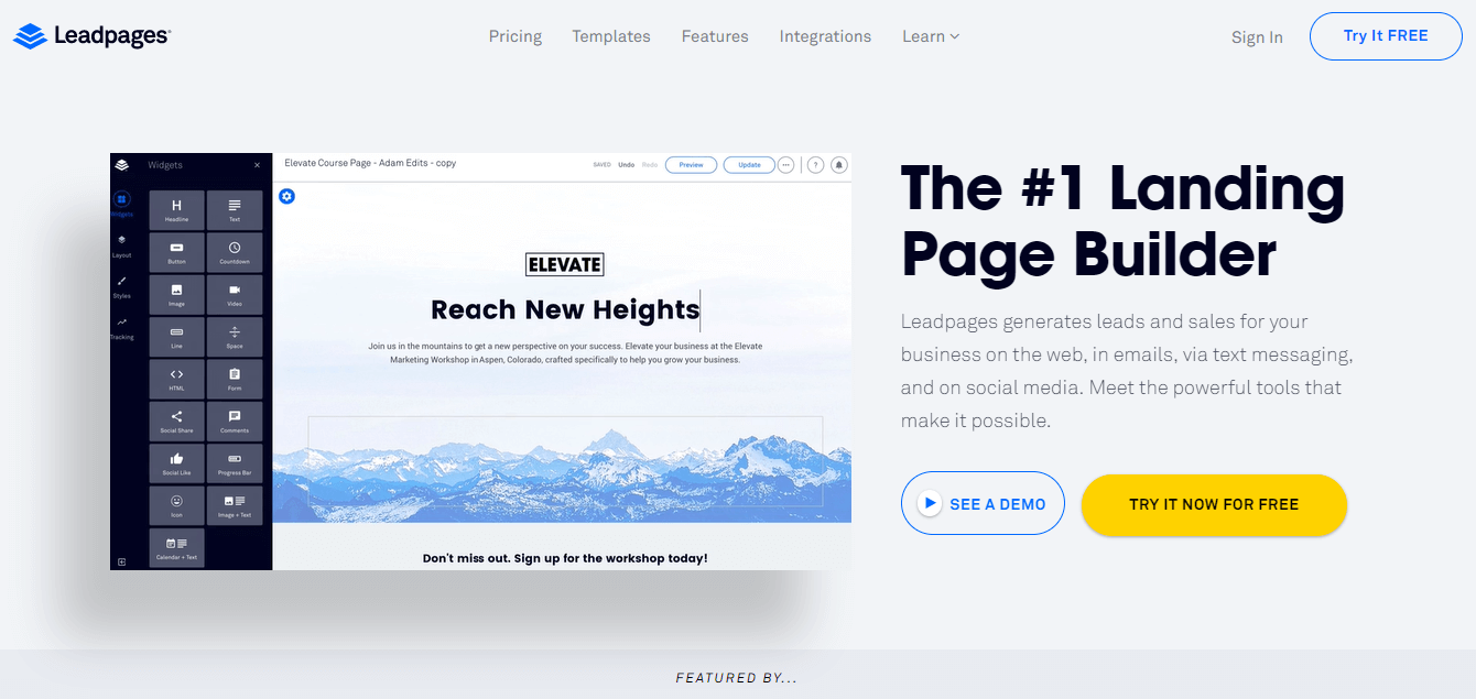
A.Leadpages, a multi-purpose landing page design tool, created this page for their free trial section.
3 things they did right:
- The architecture of the information. The used a big headline, a small body copy, and two call to action buttons.
- The buttons they want people to click is yellow, placed on the right-hand side, where the eye normally rests, after it has read the page diagonally.
- They used a great screenshot of their landing page builder editor to make the message more convincing.
B. Here is PIM on Cloud’s landing page. This company offers product information management.

3 things they did right:
- Branding. From using the brand’s colors to fonts and design style, everything about this page is PIM on Cloud.
- The powerful copy. The headline promises less workforce, while the body emphasizes the product makes other expenses unnecessary.
- A visual presentation of the benefits.
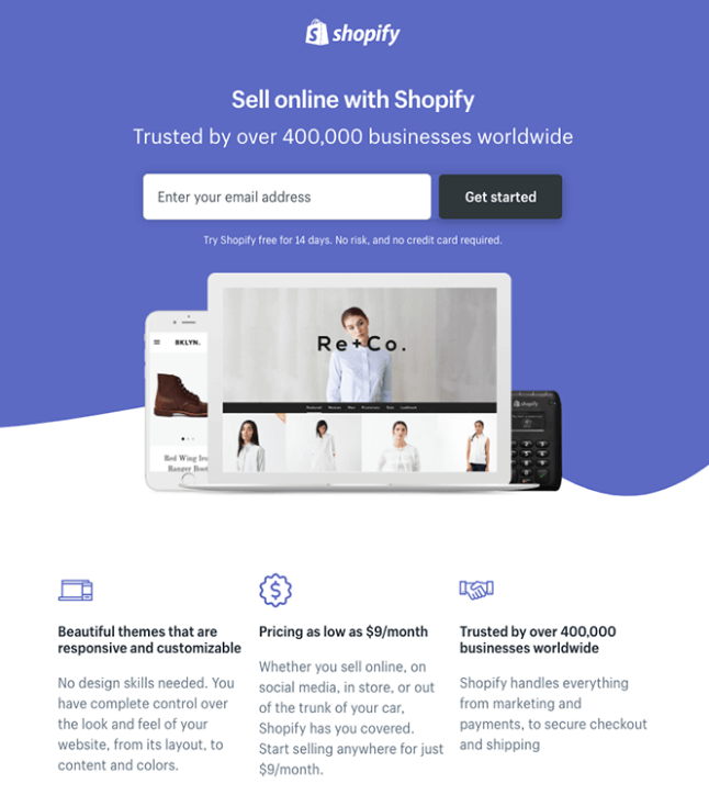
C. Being a digital giant, Shopify masters online communication. Here is their signing up page:
3 things they did right:
- The signing up field and call to action button are placed above the fold, center page.
- The visuals. They used images from their customers’ e-commerce websites to make their service more convincing.
- The visual style. They used a minimalistic style, using a lot of whitespace to center all the elements for increased legibility.
D. Likewise, Uber ,a self-service car service based on an app completely, rules when it comes to landing pages.
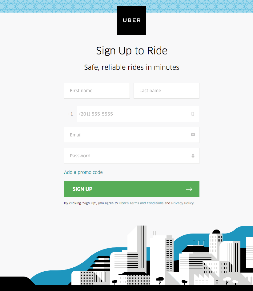
3 things they did right:
- They created a simple form for the users to sign up quickly.
- The sign up button is highly visible.
- Plenty of whitespace, minimalistic design which helps the form stand out.
E. Another great example comes from Dropbox, a 100% digital product.
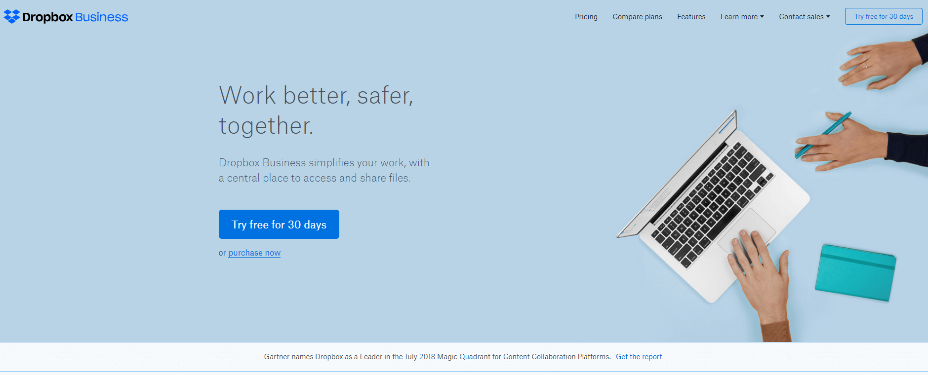
3 things they did right:
- Great copy.
- Big centered call to action button.
- Clean page, thanks to the whitespace surrounding the information. And a relevant picture.
If you’re looking for more inspiration, Landingi has published an article that boasts about 111 landing page examples, sorted by use cases and industries.
Conclusion
If you find yourself in the process of putting together a PPC campaign, this article will help you to build a professional and possibly, high converting landing page.
Use these guidelines to set up your page and create a coherent campaign, one that will guide people up to the final desired action, be that selling your products or downloading your ebook.
Illustration by Anita Molnar


www.sakarmarbo.com
December 12, 2018Very good post. I’m facing a few of these issues as well..
rutvik
April 9, 2020The explanation is very easy to understand. thanks
Mayur Gogra
May 7, 2020team GGCL learn good technique from this article. keep it up
Akshay Digital
May 7, 2020this article is learning place for akshay.digital. thanks for share knowledge and expect same in future