
Did you ever receive a handwritten letter? If so, you must remember how important the style of the handwriting was. It could tell you a lot about the personality of the sender, of the mood he was in when he wrote the letter. Whether he rushed into writing it or he took his time.
You could even tell if the sender was creative or impatient. Basically, your handwriting is your message’s signature, its body language. And you wouldn’t read an incomprehensible letter, or you wouldn’t pay much attention to one that clearly did not have much interest put into, would you?
Now, imagine that when it comes to ads, the writing is as important as in a handwritten letter. If the one that sees the ad doesn’t understand what you’re saying because of your font, you’re in big trouble.
We’ve found another analogy we loved about choosing fonts in Smashing Magazine.
“For better or for worse, picking a typeface is more like getting dressed in the morning. Just as with clothing, there’s a distinction between typefaces that are expressive and stylish versus those that are useful and appropriate to many situations.”
We’ve seen many examples of poorly designed ads throughout our online experience, and that’s the reason why we decided to write an article that emphasizes how important fonts are in social media ads.
Did you know that last year, advertising on the internet surpassed newspaper advertising spending for the first time? Marketers spent over $5 billion on social media ads in 2013 and it is expected to go over $14 billion by 2018. Paid advertising becomes more and more competitive and expensive, but it’s worth it since social media advertising is definitely a great solution to get leads and customers. Text is a very important part of a successful ad, and this can be proven by the changes Facebook made this year. Advertisers had a hard time struggling with Facebook’s 20% rule, which said that text couldn’t occupy more than 20% of the image submitted. In April, when Facebook eliminated this rule, advertisers had a bitter-sweet moment thinking that this will solve all their problems, but social media success isn’t just about text or design. It’s about the whole mix between all these.
Let’s see which are the things you need to take into consideration when choosing a font for your Social Media Ads:
1. What is the purpose of the Ad?
If you want to sell products badly, you probably won’t be using large, bold, grungy fonts. You need to adapt the style of your copy according to the product or service you’re promoting, and more importantly to what you expect from that ad to do. Do you want to sell with your ad or do you only want to raise awareness? Do you want people to engage with it or you only want them to click on the link? The ad is the bridge between the landing page or blog post and the user.
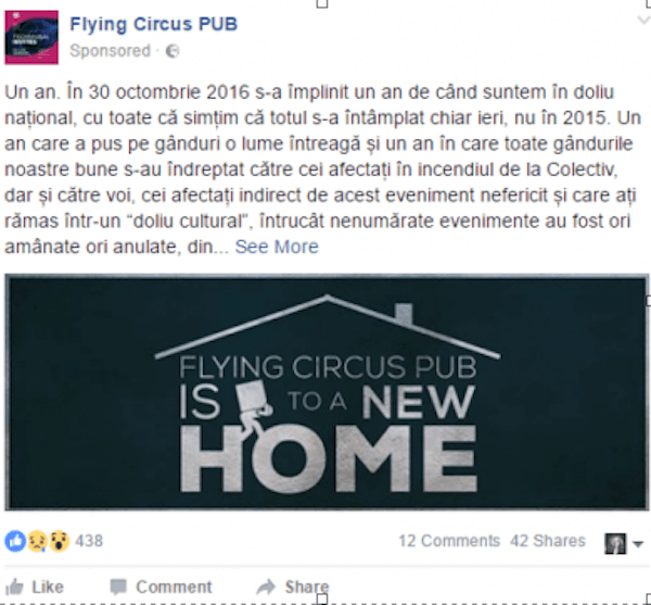
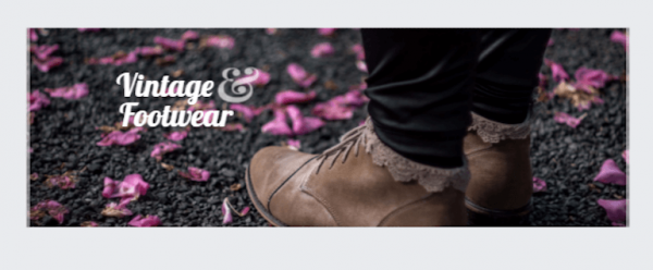
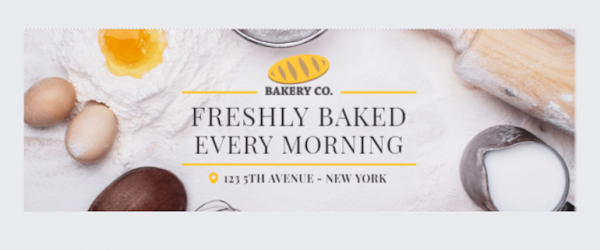
Let’s take this ad for example. It announces that the club is moving to a different location. The designer played with the graphics and the font in order to introduce people who love the club to the news.
2. What is the tone of voice and identity of the brand?
You need to follow the brand guidelines and tone of voice. If the brand has always used small caps in their communication, you should do the same too. If it’s a brand that is always friendly in its communication, has a perky tone of voice you will have to adjust your design according to that.
3. To whom are you addressing the Ad?
We’re always bringing the audience into the discussion, but that’s only because it’s one of the most important (if not the most important) part that should interest us when designing an ad.
Before starting to look for fonts, make a short research on to whom will the message get to. Is your audience formed by millennials? Is it formed by older people?
4. What’s in trend?
Just like fashion, typography has its trends too. For example, a few decades ago serif fonts were the hot thing of those times.
That’s why your grandparents (applause for the older people on the Internet, please!) would probably be more tempted to click on an ad that’s written in serif – because it looks familiar. On the other hand, you and I grew up with sans-serif fonts and we’re tempted to like more simplistic and minimal fonts. Hand lettering fonts are always in trend for some types of ads or products. We made a quick research for you and found out which are these years trending fonts:
You can find all these fonts in Bannersnack too.
Montserrat – https://www.fontsquirrel.com/fonts/montserrat
Open Sans – https://www.fontsquirrel.com/fonts/open-sans

Lato – https://www.fontsquirrel.com/fonts/lato

Amatic – https://www.fontsquirrel.com/fonts/amatic
Lobster – https://www.fontsquirrel.com/fonts/Lobster
Playfair Display – https://www.fontsquirrel.com/fonts/playfair-display
Roboto Slab – https://fonts.google.com/specimen/Roboto+Slab

(list carefully curated by our awesome designer, Gery Meleg)
There are another two very important ingredients you need to take into consideration when looking for the right font for your social media ads. The first one is readability – if the user you’re targeting can’t read what you’ve written on your ad, you just threw money out the window. Make sure no matter what type of font you choose, it can be easily read and understood.
The other very important ingredient is reminding yourself that Social Media is a ginormous universe, in which everybody wants a piece of attention from the users. That’s the reason why your font must go hand in hand with your design and brand’s identity. All these, put together, form the recipe for a successful social media ad, that stands out of the crowd and fulfills its purposes. That is why in Bannersnack we give you the possibility to upload your own fonts.
If you want to know what’s the correlation between psychology and fonts, you should read this study. It’s interesting to see how fonts can impact the way people feel when reading them.
And don’t forget the most important thing you need to know and designer’s well known ‘font-non-grata’: NEVER USE COMIC SANS.
PS: A few months ago we’ve written an eBook on how to design awesome Banner Ads in collaboration with Hubspot. There’s some useful information there too that might help you design your Social Media Ad.


Ruhrpott Marketing
February 9, 2018Thank you for the informations about fonts. It help us to make better ads.
Andrew