
With so many details to consider when creating a banner ad, button design may seem like a rather unimportant aspect. After all, it’s just a button.
Well, seasoned designers may have something to say about this. Actually, they strongly emphasize the importance of button design in online banners, because they are essential elements of interaction design. The placement, color, size, and call to action of a button may or may not entice people to click an ad. Thus, the success of a campaign can hang on a tiny thing like button design.
PPC specialists agree. A highly optimized button can increase click-through rates (CTR).
Aspects you need to look at when designing a button for your banner:
There are certain things you should know about buttons. Let’s see some design guidelines, and then proceed to the big brands’ examples, to understand more.
- Color – First things first. This may seem obvious, but if you pay attention to the banners online, you’ll notice loads of inappropriate button colors, buttons that don’t stand out because they’re the same color as the background and the list goes on and on.
There is no general rule for button color, like use green or yellow (though some may advise you to), but it is better to use contrasting colors. I’ll tell you more about this below when we analyze banner examples.
- Shape – The most used button shapes around the web are square shaped and rounded corners buttons. They are either filled with color or look as colored borders. These shapes may be old school, but they provide the perfect framing for a call to action and help to balance the layout.
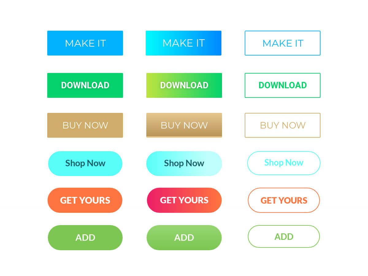
- Call to action– this text should be short and prompt users to take an action. Like “Buy Now”, “Shop Now”, “Get offer” etc..
Also, the CTA should create a sense of urgency. Use words like “now” or action icons.
You can always go for creative CTAs, but be careful not to sabotage your objective, that is motivating the user to click your ad.
- Positioning – there is one simple rule in banner design regarding button placement: put your buttons where users expect to find them.
Generally, the human eye will scan a visual image right to left (not left to right), that’s why it is best to place the button in the lower area, left, central or right, depending on what other elements you work with and must include in the visual.
- Size – The size of the button should be large enough to allow users to read the text easily. However, if you make the button too big, it will look dissonantly related to the overall layout. For mobile users, the buttons should be finger-friendly. In other words, make the buttons big enough for the users to tap them. Sometimes, due to the small size, users mistype.
- White Space – Buttons should always have considerable white space around them. White space helps the button stand out and makes the call to action more legible for the users.
- Borders – this effect is somewhat outdated, but if you insist on using borders, use transparent buttons with borders. These buttons are a transition between regular buttons and plain CTA texts.
- Shadows – Use shadows only if it’s a must and make sure they’re subtle. If you use heavy shadow effects, you’ll have a button that looks old at best, cheap at worst.
And now, let’s see some fantastic button examples and learn from the best.
Buttons that fit perfectly within the branded context
#1. Hello Fresh’s – Get 60% OFF button
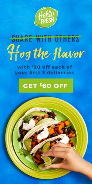
Using a color from your brand’s palette to create buttons is not only politically correct but also aesthetically pleasing. Let’s take this Hello Fresh banner, for example. Their palette is made of green, blue, white and a bit of orange. The logo is white and green. The button is also white on green. Artists call this color harmony, meaning that certain colors combinations create pleasing contrasts and consonances.
#2. Royal Canin’s Feline Ultamino red button
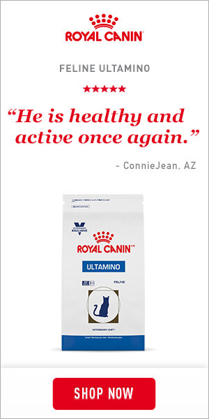
Royal Canin follows the same principle here. Red logo, red button.
Red buttons are proven to have the highest click-through rates. In an A/B test ran by Performable, red buttons outperformed green buttons by 21%.
This button excels for many reasons: it’s got a branded color, it is placed in the center of the ad and completes the symmetry of the elements.
#3. Axe’s “Avoid awkward” banner ad
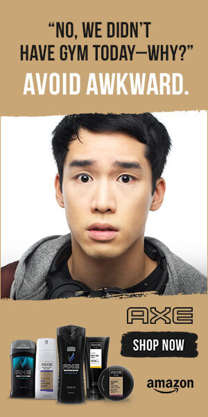
We won’t discuss the placement of the button here; we will strictly comment on the branding colors.
Here is a masculine color palette made of brown, black and white. The button, black, stands out from the brown background and one can easily read the white text.
#4. Gatorade’s 20% OFF display ad
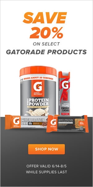
Gatorade’s orange and grey color palette makes it easy for the user to read this banner. Not only does this orange button on grey background pop, but it also urges the reader to click.
The elements of the banner are symmetrically organized to fit the layout, and the button, center-stage, prompts the user to take the next action.
#5. iPhone X’ Carryover plans banner ad
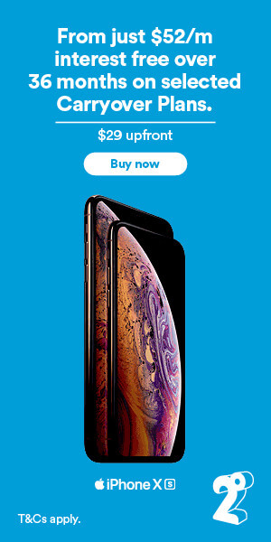
There’s only one thing to say about this ad: Apple design, all the way. From the sans serifs font to the rounded corners button that borrows its shape (probably) from the new iPhoneX, this banner is totally in-line with Apple’s branding guidelines.
#6.Pepsi’s “Game day” pack banner ad
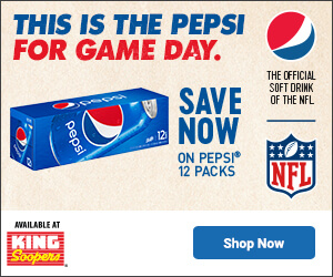
This is probably one of the best banners I’ve ever seen, in terms of button placement, branding, and legibility (despite the considerable amount of elements). All this without cutting creativity and design! Taking its color from the brand’s logo, the blue button is perfectly placed on the white background, on the right-hand side, where the eye expects it to be. As you can see, it is clearly separated to increase the chances of getting noticed. Well done, Pepsi!
However, I wouldn’t advise you to imitate this banner, when faced with multiple elements, unless you’re an experienced designer. It may come out junky.
#7.Netflix’ House of Cards new season banner ad
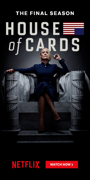
Netflix is well-known for its strict banner style, featuring a red button. As a digital product, Netflix’s main advertising channel is the web, which places massive importance on banner design.
In this promo banner for the House of Cards series, the red button stands out on a black background, on the right-hand side. The Netflix red is by now a trademark, so they don’t use any other colors to signal the call to action.
Prominent buttons
#8. Honest Tea’s banner campaign
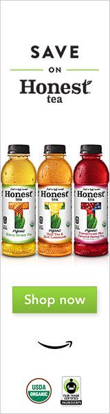
Simple and straightforward, this banner is enticing enough to make us click the button. Also, notice the little Amazon smile below. That adds a lot of meaning to the visual. Isn’t it?
#9. Snickers’ “Get satisfied” call to action
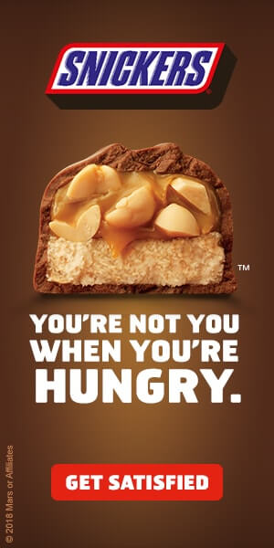
Notice Snickers’ logo colors: dark brown, red, vivid blue and white. Now, notice the button (if you haven’t already): a big, red, centered button with a text invitation to “Get satisfied”. Sounds tempting, doesn’t it?
This button owes its success also to the placement, halfway through the bottom of the banner, equally surrounded by white space on all sides.
Buttons with clever call to action messages
#10. Disney’s Star Wars Cruise – “Explore, you will!”
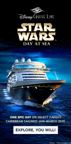
I am convinced that anyone who’s seen this banner and watched at least one Star Wars movie, had an instant grin.
Notice how the Yoda sentence topic provides the words with an entirely new weight. Click, you might.
#11. Durex’ “Press here”
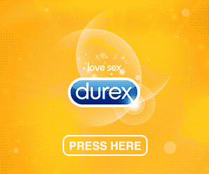
Who doesn’t love a good joke alluding to sex? Although “Press here” is the actual description of the clicking action, when associated with Durex, it suddenly gains new meanings. And imagination starts to run wild. Be honest, what did you think of when you first saw this banner?
This is one of those rare cases when the text button is bigger than the headline. The power of copy in action enables interaction.
#12. Taco Bell’s egg taco display ad – “Shell yes”
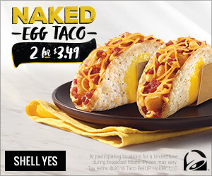
This is just another example for you to understand how creative call to action messages can make a huge difference and transform an ordinary display ad into a memorable one.
Combining the musicality of the word “shell” (crust), and the decisive “Hell yes” expression (used as a reply, whenever someone brings forth a proposition) these guys managed to create the “Shell yes” call to action. Meaning: Hell, yes, gimme the shell egg taco!
Pretty awesome!
Minimalistic buttons
#13. Victoria’s Secret has a button design secret
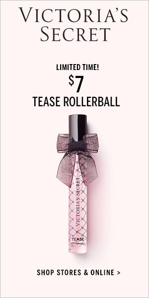
Some like it hot and loud. But others prefer to keep banner design simple and minimalistic. Including the button. When you’re a feminine brand like Victoria’s Secret you just cannot afford to ruin your brand’s image with a big button.
In fact, many fashion brands use call to action texts without buttons.
#14. Burberry’s “Shop gifts” minimalistic button
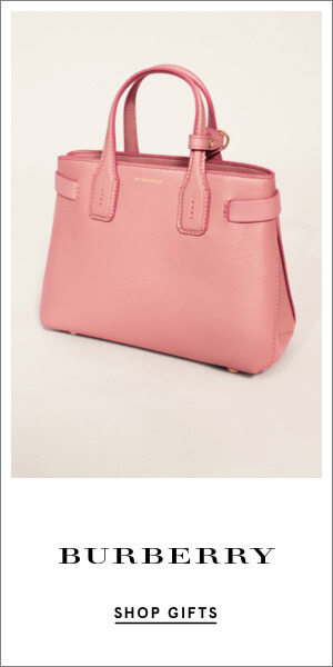
Same goes here. Why use a rectangle button when you can prompt people to take action with a simple black on white call to action. Underlined.
Buttons with action icons
#15. Amazon’s job openings banner – “Apply now”
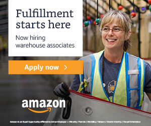
Little icons can add a new level of action and urgency to your button. Take this little arrow, for example. It suggests there is a website somewhere and you can apply there by simply clicking the button. Come on, take action. Apply now and get hired.
#16. Jeep’s new Cherokee display ad – “Get updates” call to action
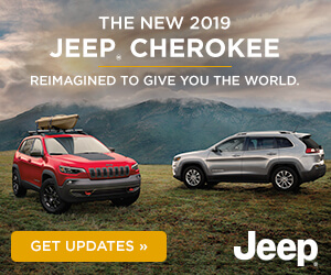
Two arrows double the sense of action. In this particular Jeep banner, the two arrows point to the act of driving and speed. Accelerate and get updates. Be up-to-date with Jeep’s news about the 2019 model.
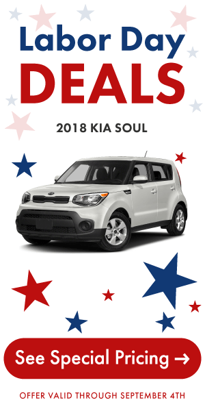
#17. Kia Soul’s Labor Day banner ad – “See Special Pricing” button
“Hurry up, discover the amazing price!” the button seems to say. Though they promise a special Labor Day discount, Kia is not willing to share the new price upfront with anyone. Instead, they created a festive banner ad, added a huge border-to-border red button, placed a big arrow on it and just expect people to click and see the offer. That’s true self-confidence.
Now, follow the arrow’s directions.
Animated buttons
#18. Volkswagen Tiguan clock-ticking CTA
Click the play button to see the animated banner.
Here we are, finally, talking about animated buttons.
Animation effects allow designers to get insanely creative with banner buttons. Take a look at this ad’s button: it pops up quickly, a shiny line effect instantly crosses the button left to right, and there’s a crazy ticking clock on the left which urges us to act now, while the offer is still on. Think you have time? Think again. Do it now or never!
Well done, guys!
#19. Mazda’s CX-9 model banner ad – “Build yours” call to action
Click the play button to see the animated banner.
Everything in this ad is about elegance and style. Inspired by the new CX-9 Mazda model, this animated banner ad is an HTML5 masterpiece. Even the animation effect of the button is in-line with the stylish design and grandeur of the product. Build yours!
#20. Gilette Venus Platinum “SHOP NOW”
Click the play button to see the animated banner.
It would have been such a loss for this top-notch razor from Gilette to be promoted through a regular, static banner.
Now, considering the Venus razor targets women, the designer chose pink as the color for the button. The animation effect (sliding left to right) matches the same level of action in the headline (Go Platinum). As for the call to action, it is simple and straightforward: “Shop Now”.
Start creating clickable buttons!
I hope you’ve found these examples useful and inspiring. And maybe next time you’ll feel like you want to get the job done fast, you’ll remember these case studies and the takeaway tips I’ve listed at the beginning of the article. Take your time and choose carefully the color you want to use for your ad’s button, its shape, placement, size and what text you want to have there. Also, consider the white space surrounding your button and the white space all around the text within the button. Every little detail counts!
Go ahead, create enticing buttons and prompt people to click your ad. Sign up for free and use our online design tool.
Happy button designing!
Illustration by Anita Molnar
clippingpathlab
May 22, 2020Your posts is really helpful for me.Thanks for your wonderful post.
Akash
December 18, 2020Good to know lot of things. Thank you.