Every brand has a personality, and every marketer/designer should know how to speak its language without using any words. Easy, right? But branding is a full-house game constructed around conveying a message, building experience, and constructing a relationship with the audiences.
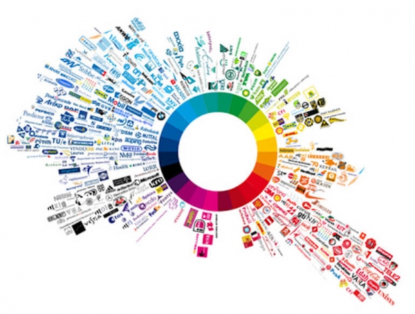
The personality of the brand is perceived by different factors — and I say perceived because the visuals are important more than ever. The colour combinations that dress your brand are playing an important role in how they support this personality that you want to portray.
Basics of colour psychology can help you achieve great goals in advertising.
So as I spoke before about the importance of translating your Brand Identity Book into your banner ad campaigns, I’m deepening this conversation to how your brand’s colours wake up specific reactions, actions, and conversions in the banner ads you create.
Before starting, keep in mind that even though colours have an influential role, they have to align to the context, the product and the message brought up by your brand. You have the rightly chosen colour when it fits emphasizes the product, not fights with it.
So, don’t panic when a colour speaks one thing, but in relation to the brand, it delivers a slightly different response.
Further on, I’ll be talking about ten colours from two perspectives:
- What does it speak alone?
- Examples of how brands used in conveying their message through branding and banner advertisement.
After reading this article, I promise you’ll be looking at your brand with different eyes and from there, the possibilities are immense and yes, you’ll know how to use the colours in your banner ads so it can bring you closer to your goals.
1. Yellow
Though a colour that associated with optimism, energy, and sunshine, yellow is also a rich colour reminding with gold and treasures.
Still, too much yellow can be risky, because it can be irritating to the audiences’ eye, and therefore is recommended to use it in moderated dosage.
National Geographic, the yellow-rectangle brand, both maintains the brand presence with the yellow logo and details and balances it out with a blue or black background. The yellow CTA invites to a journey of discovering treasures and adventures:
Snackable Tip: Yellow alone is a very powerful colour and you should balance it with black or blue. Use yellow for industries like traveling, exploring the world and industry that aims to make the customers act fast in their buying decisions.
2. Orange
As it stands out of the crowd and invites the audiences to be creative, friendly and enthusiastic, orange awakens the desire to be young again and to enjoy youth.
Depending on its purpose, the dosage of orange is used as following: alone on a whole banner to grab the attention of the young minds and alongside with black, grey or white for balancing and highlighting purposes.
You can see how depending on the audience, the message, and branding, companies like Fanta and Harley Davidson use orange both in their logo and in their banner ads — again, the context is defining the visual:
Snackable Tip: Use orange for brands whose buyer persona is always young at the soul and want to be seen out of the crowd.
3. Red
Red is about everything. Passion, speed, love, and fire. It is activating, stimulating, passionate and powerful, and this is a colour that awakens powerful sentiments.
It is changeling because it is not just about the colour — the context is very crucial here for your brand’s personality should be able to live it to the colour. Red is an experience that has to be backed up by both the product and the banners you create for it.
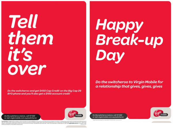
A perfect example is Richard Branson’s Virgin Group, which is a bold statement in innovating any of the areas he goes in — from airline, mobile and TV services to banking, retail, and film industry.
Branson has an energetic personal branding, in which he praises speed, passion, and dedication for whatever you’re doing in life — and this the statement which justifies the colour red used in his branding and advertising strategies. Because Branson can be just as shocking and provocative in his company because his lifestyle is like this. The context — remember?
And yes, the perfect combination in design — red and white, combined with a provocative message, like this one for their Valentine’s Day Virgin Mobile ads, in which they attract customers by telling them to break up with the other mobile operator:
Snackable Tip: Use red for a brand that inspires a sense of urgency and makes your heart pump more blood – in industries like food, retail and entertainment industry.
4. Purple
The colour of royalty, luxury, wisdom, that also inspires to ambition, creativity and magic, gives a sense of “anything is possible”. Any first encounter with a brand, which created its Colour Palette around purple and also translates it into their banner ads, is basically inviting the customers to explore the extraordinary in a world of ordinary and “be more”.
Purple is bold and transforms the “impossible” to “I’m possible” and therefore the brand’s personality behind such a colour should just as much relate to the opulence, grandeur and leadership. On the other hand, purple has always been the colour of the royalties, which embodies tested trust and influence.
One of the companies that is playing their card nicely around the purple colour is FedEx, who bring something different in their service than just shipping services. Their rhetoric in the banner ads goes from discovering inspiring ambitious stories to brand awareness about company’s expertise, honour, dedication and effort in their work.
All of them, yes, right — complemented with the honorary established purple:
Snackable Tip: Purple is for brands that want to inspire trust and credibility – baby products industry, companies whose products focus on the whole family as their audiences and those that take as a responsibility to deliver exceptional service.
5. Pink
Depending on the intensity of the shade used, pink is both impactful and caring.
When a brand choses intense vibrant pink shades, it automatically brings a youthful energy and stands out, mostly because of the combination between cold and striking.
Companies like T-mobile shock with the eye-catching magenta pink, which is present from the logo to the store’s colour and the banner ads.
Paler and dusty pink shades have a girly to sentimental message, and is usually used by brands which have women and girls as their main audience.
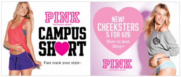
Victoria’s Secret is well-known for their brand sexiness, and when the brand decided to turn their attention to their growing customers, the teenage girls, they created VS Pink. The new sub-brand chose to go with soft, but daring pink. In my opinion, PINK is a bridge between the Hello, Kitty customers and Victoria’s Secret main stage — and VS efficiently incorporated both childish and sexy.
In one word – VS Pink is growing up teenage girls to mature women.
Snackable Tip: Pale pink is a perfect colour for the companies whose buyer persona are little and teenage girls, while strong pink is a motherly and bold colour for a brand who is out of the pattern, but also caring and wise.
6. Brown
Brown is the Mother Nature, the relaxation, luxury and tradition that proved stability over the decades and hundreds of years, even.
The link between brown colour and the soil, the “dirt” may harm the brand’s personality, but it also portrays the brand as an established name that has its expertise in the long history.
Earthy, simple and honest, but also classic, genuine and hard to replicate, a brand that embraces the brown colour is a proven history of tradition.
But to play the innovation card, established brands mix the nuances of brown, just like Louis Vuitton or UPS does in their ads. With a history of over 100 years for both brands (UPS was founded in 1907 on August 28th and LV in 1854), both brands hold onto a strong position both as the traditionalist, luxurious but innovative brands. Their banner ads found across the web, prove this:
Snackable Tip: Use brown in brands that focus on their rich history in the industry: fashion, retail, and services that bring both luxury and down-to-earth service.
7. Green
An emotionally colour signifying growth, rebirth, and nature, prosperity and abundance. Green is peaceful, calm and relaxed, and deeper shades of it can stand for wealth and luxury.
It is a complex colour both offers a sense of security and intrigues. But most important, green is a must for brands that produce in the name for fresh and natural — be it bio products or are in the food industry.
One example of a great rebranding strategy is British Petroleum, which happened in 2000 when they changed the 70 years logo to a green-and-yellow Helios – the name for the Greek sun god. In the new strategy, British Petroleum saw a rebirth from just a company that extracts oil by challenging the green growth with its new logo symbolizing rebirth and closer to nature.
From that moment, every move in their brand strategy is around the green colour and palette and green change, and the banner ads are not an exception:
Snackable Tip: Green is for the bio, healthy and environment-related companies – it brings a fresh sense of a new life.
8. Blue
Blue is such a difficult colour to put in a box, because it is used in such broad areas and is the colour of dependability. It gives a sense of strength, tranquility, and assurance.
To prove the stability of one brand’s personality, deep and serious blue is used in areas like technology with Samsung, IBM, SAP, Dell or HP; in engineering – General Electric and Ford; for the banking and related sectors we find PayPall, American Express, Chase and City Bank, and even social media brands like Facebook, LinkedIn, Twitter.
When used in a lighter shade, blue transforms into a tranquil ‘robin’s egg’ blue that is both peaceful and calm, but also compassionate and caring.
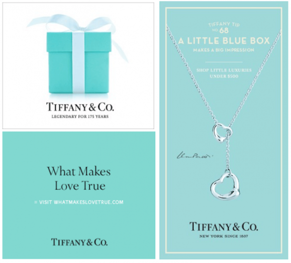
One of the brands that pretty much trademarked this ‘robin’s egg’ blue is Tiffany & Co., and you can find no other brand that can pull this colour without being associated to the ‘little blue box’ company. So, as you’d suppose – Tiffany’s main pièce de résistance is their remarkable distinguish colour, which they put from jewelry boxes to shopping bags and advertisement.
Take a look at their minimalist banners and make your bet:
Snackable Tip: Blue is for technology, banking, IT, Social Media online networks and companies that want to inspire trust and dependability.
9. Black
Technically, black isn’t a colour, for it is the absence of colour. But a lot of brands use in their branding the black colour combined or the simple plain black logo.
It can stand alone because it is bold, powerful, confident and sophisticated combined with mystery, power, prestige, and formality. One of the most readable combinations: black and white; one of the most powerful — black and yellow.
A brand that embraces black in their branding strategy, and also their banner ads, automatically transfers elegance, luxury and high quality sense of their brand. Let’s take, for example, BlackBerry – who capture a brand promise that directly addresses the user’s desire for success in life and at work. Backed-up by the important leaders who use their phones, like Barack Obama, the company aims to get to the smarts, charisma, and confidence their product delivers. In their ads, they usually play with a bold all black banner that has some touch of colour.
The main focus on black positions BlackBerry as an above the average product, for the ones who are bold and settled:
Snackable Tip: Companies that offer a strong sense of manliness and power use black – car industry, technology, newspaper and journalism industries and sport companies.
10. White
To counterbalance white, which is actually a mix of all the colours from the spectrum, one needs to find a balance for it. White cannot stand alone and therefore it is usually assisted by another colour.
Simplicity and purity is aiming for the customers and audiences who already have their loyal customers in the house. But this does not interdict to choose a bright colour in your branding and advertising strategy. Why so? Because white catches the eye immediately. Why not? Because white is usually associated with the healthcare industry and baby-related products.
For an established like Apple, it was quite easy to bring the cleanliness of their products and service on every corner they were present — in the stores, on their website, on their products, and yes, you’re right — in their banner advertisement. No matter of the region the company adverts to, the colour range is simple and minimalist — it is white and light grey used for the packaging of the products.
The plain white background both in the banner ads and in stores, gives the customer a lot of space, but to choose from only one product:
Snackable Tip: White can be used in the healthcare industry, medical drugs industry and brands that are powerful by their simplicity – IT and technology.
Conclusion
The road to advertising mastery is one that teaches you a lot, and most lessons you get to know from the alignment of your product, your branding, and advertising strategies.
There is a lot to learn when creating a universal message around your products, nonetheless, it helps you gain credibility around it. Using an online graphic design tool could be of great help.
[Tweet “The colour of your brand is a call to action itself”]It goes rounds and rounds until it reaches the point where all your messages are conveyed around the one thing that defines your brand.
It’s a world full of visual messages, where 70% of all our sensory receptors are in our eyes — so make the best use of one colour that would represent you the best and bring you the outcomes you aim for.
Leave us a message of the colour you’ve chosen for your brand and tell us how it represents your idea and product.









Mo Lima
November 2, 2016I have a correction for you. UPS was founded in 1907 on August 28th. I’m a UPS employee and we celebrate that day as Founder’s day each year. It’s kind of a big deal.
Robert Katai
November 3, 2016Thank you Lima for updating with the real info! We appreciate it:)
Turnera Croom
December 11, 2016Great article. But isn’t white an absence of color and black is all the colors?